Create a clear collection experience
Make objects, states, and actions easy to understand.
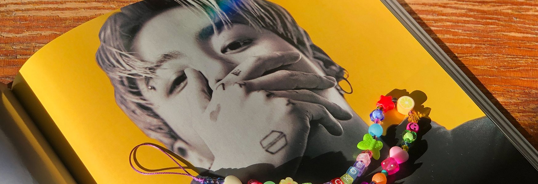
Digital product experience for collectors.
Purple Collect is a digital experience around collecting, ownership, and presentation. The brand came with a loud, distinctive visual identity, and the design problem was making a daily-use product out of it without the style getting in the way of the managing, browsing, and collecting.
Make objects, states, and actions easy to understand.
Keep the experience functional while preserving the brand's strong visual tone.
Reusable components that scale across future views.
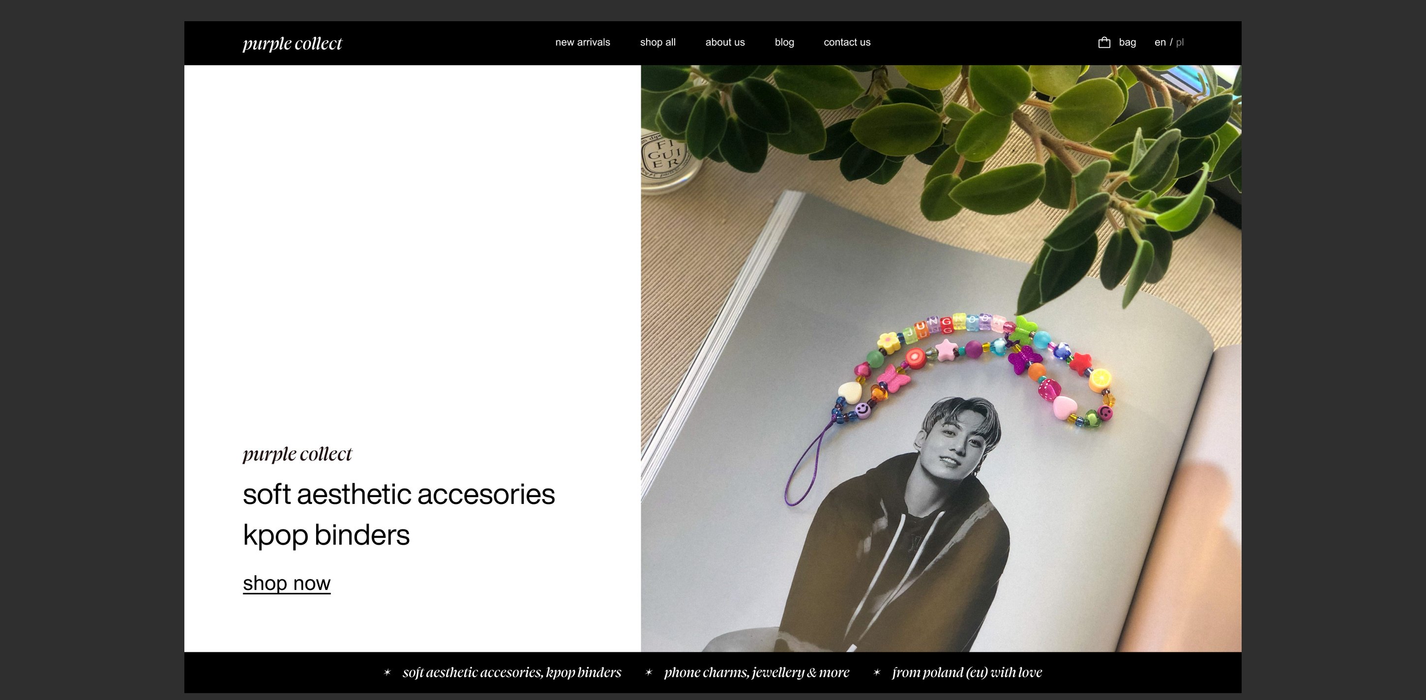
The identity was loud, and the temptation was to make the interactions loud too. We kept the split deliberate, color, type, and tone carry the brand, while the interaction patterns underneath stay boringly conventional. Collectors come back daily to manage their items, and novelty interactions age fast at that frequency. The brand gets the first impression. Usability gets every visit after that.
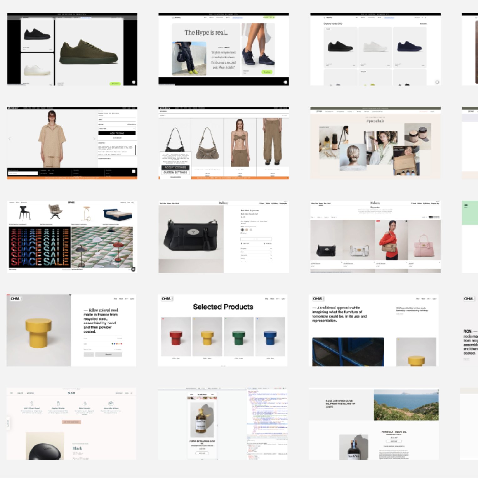
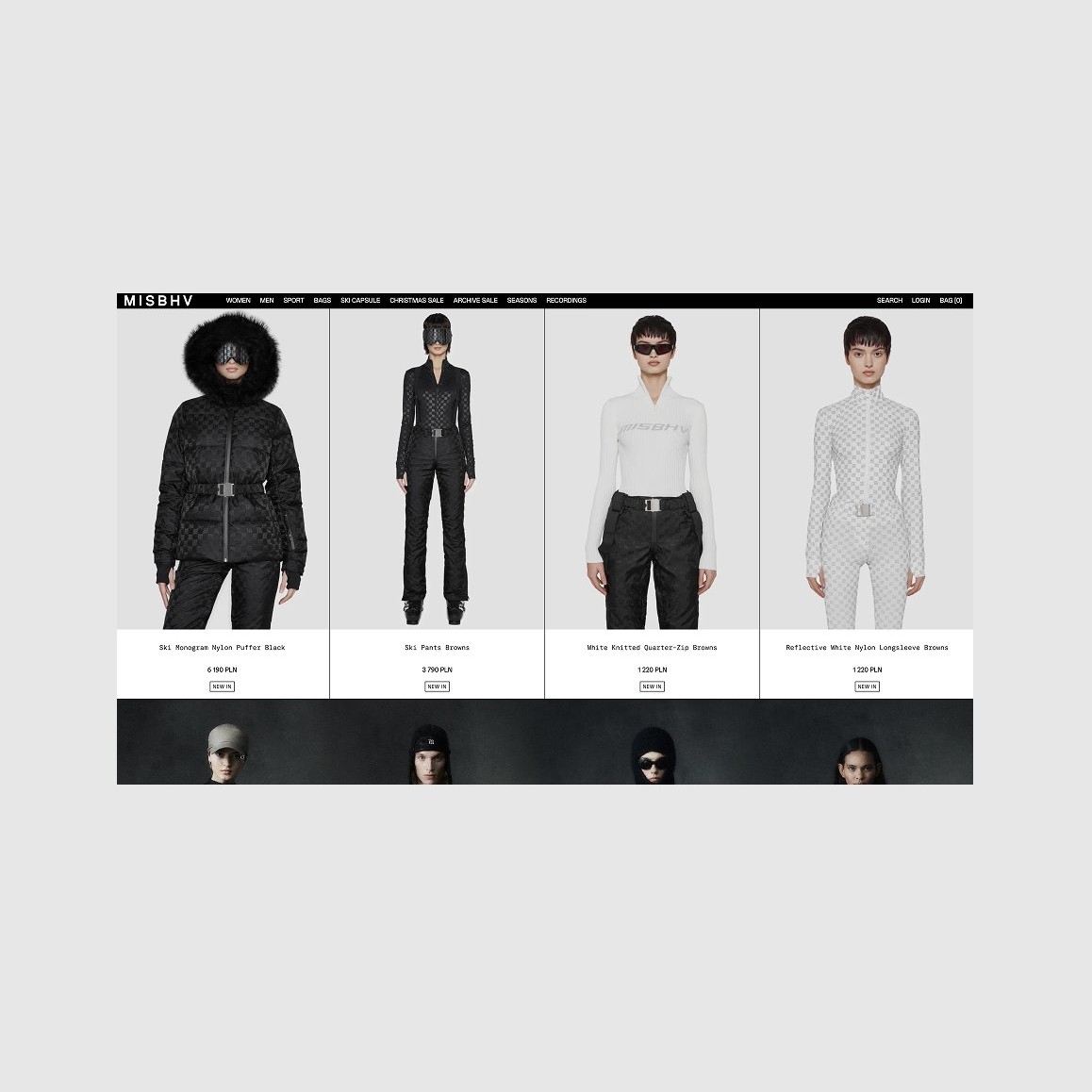
The strategic question was how far editorial expression can go before it starts costing sales. I collected both ends of the spectrum, generic e-commerce that converts but says nothing, and editorial stores that say everything and bury the buy button, and drew the line for this brand between them.
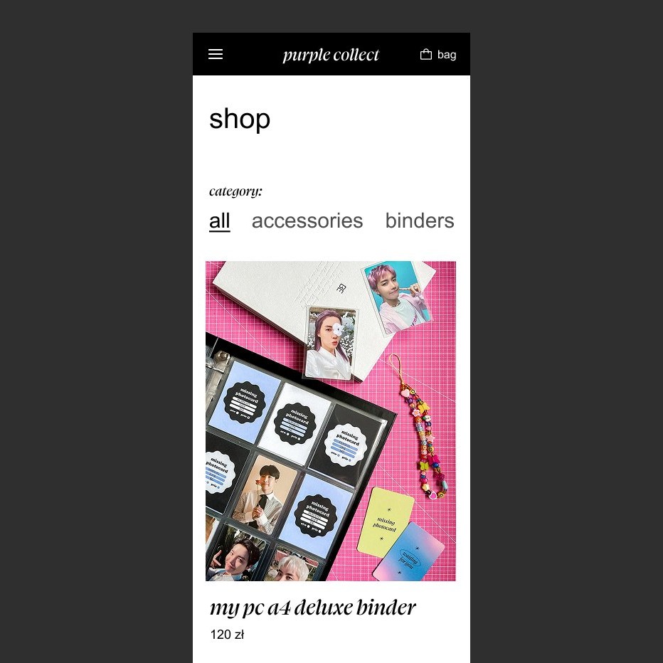
The structure helps users browse, understand, and manage collected items.
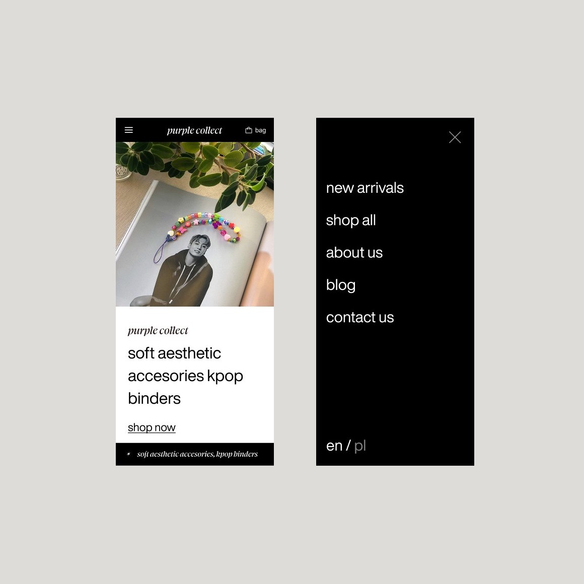
The interface carries the brand tone without letting style obscure interaction.
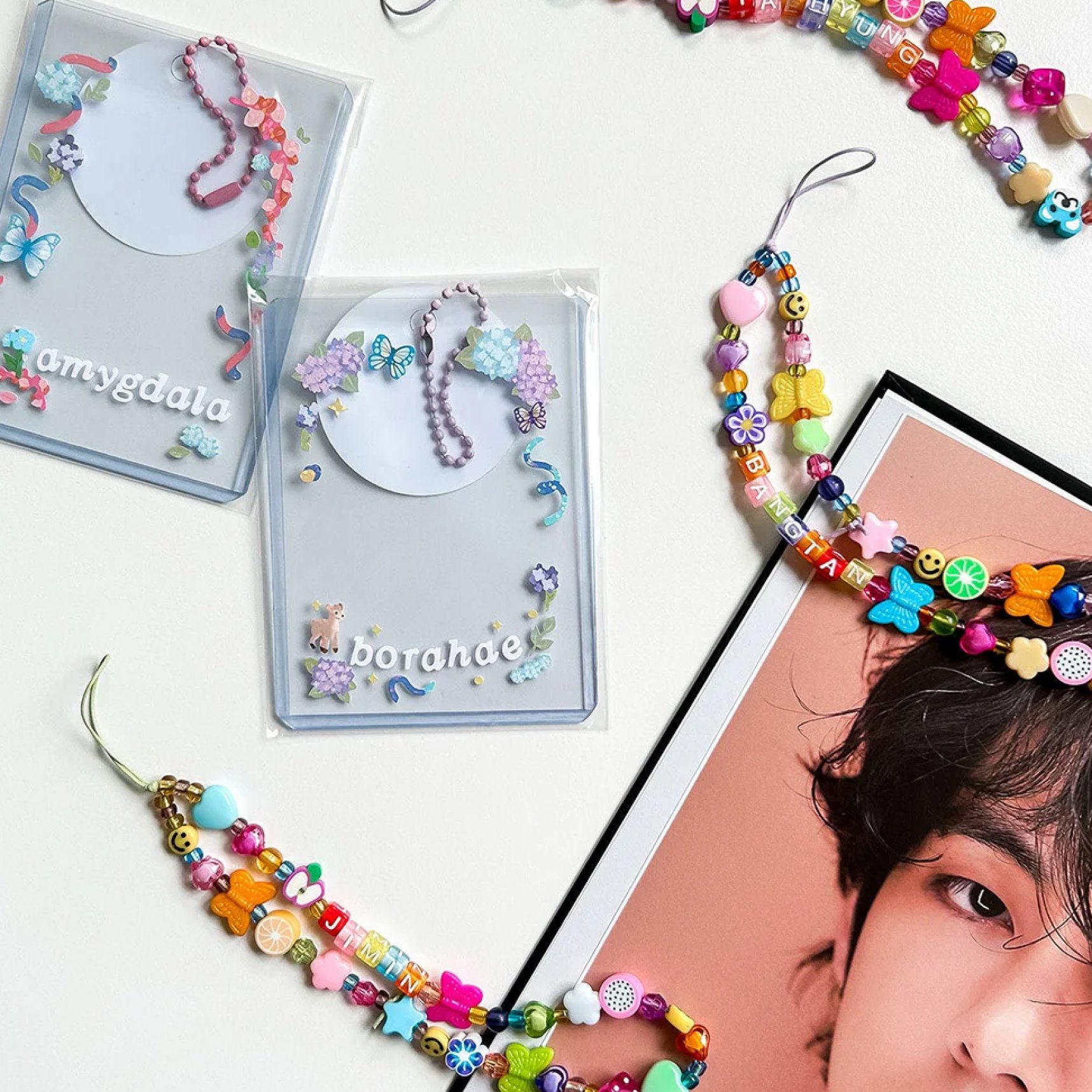
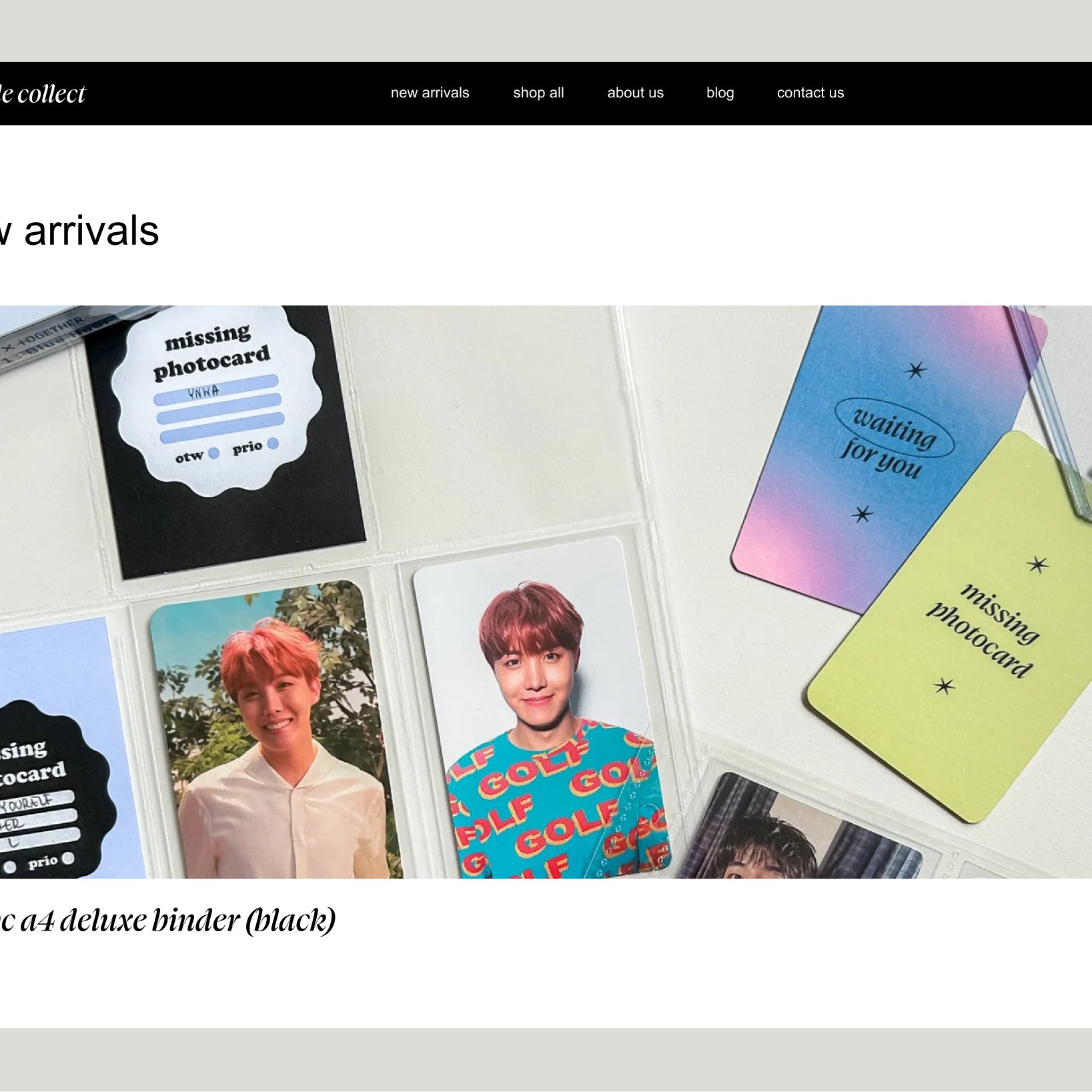
The split held, the brand stayed loud on the surface and the interactions underneath stayed boring, in the good sense. A collector opening the product for the hundredth time isn't fighting the identity to manage their items, and the identity hasn't been watered down to make that possible. That balance was the whole assignment.