Make campus life easier
Bring common university interactions into one clear flow.

Bringing everyday student life into one connected product.
Uni app is a concept for one product that holds a student's day together. Universities communicate through scattered systems, schedule in one place, announcements in another, deadlines in a third. The concept starts from a simple question, what does a student actually need to know at 8 a.m.?
Bring common university interactions into one clear flow.
Reduce fragmentation between schedules, updates, tasks, and services.
Patterns that work every day, several times a day, without friction building up.
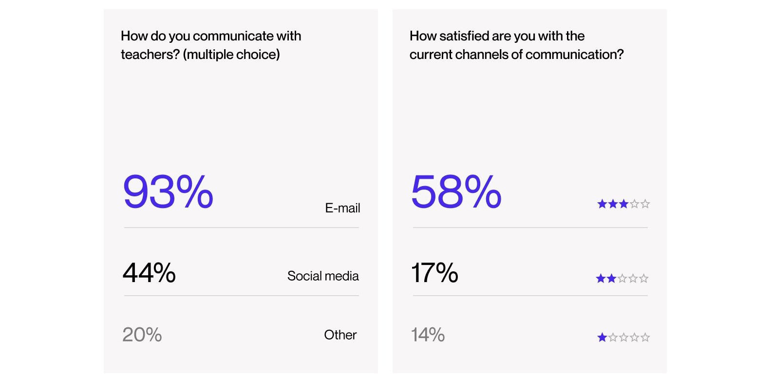
Students and teachers from universities across Europe and the US filled in online surveys. The numbers were blunt, 93% communicate with teachers by e-mail, 82% had missed an important school announcement, and satisfaction with existing channels was low. Social media came up repeatedly as the channel people disliked, it mixes school with private life and sits badly with data protection. That's the case for a separate, boring, reliable channel.
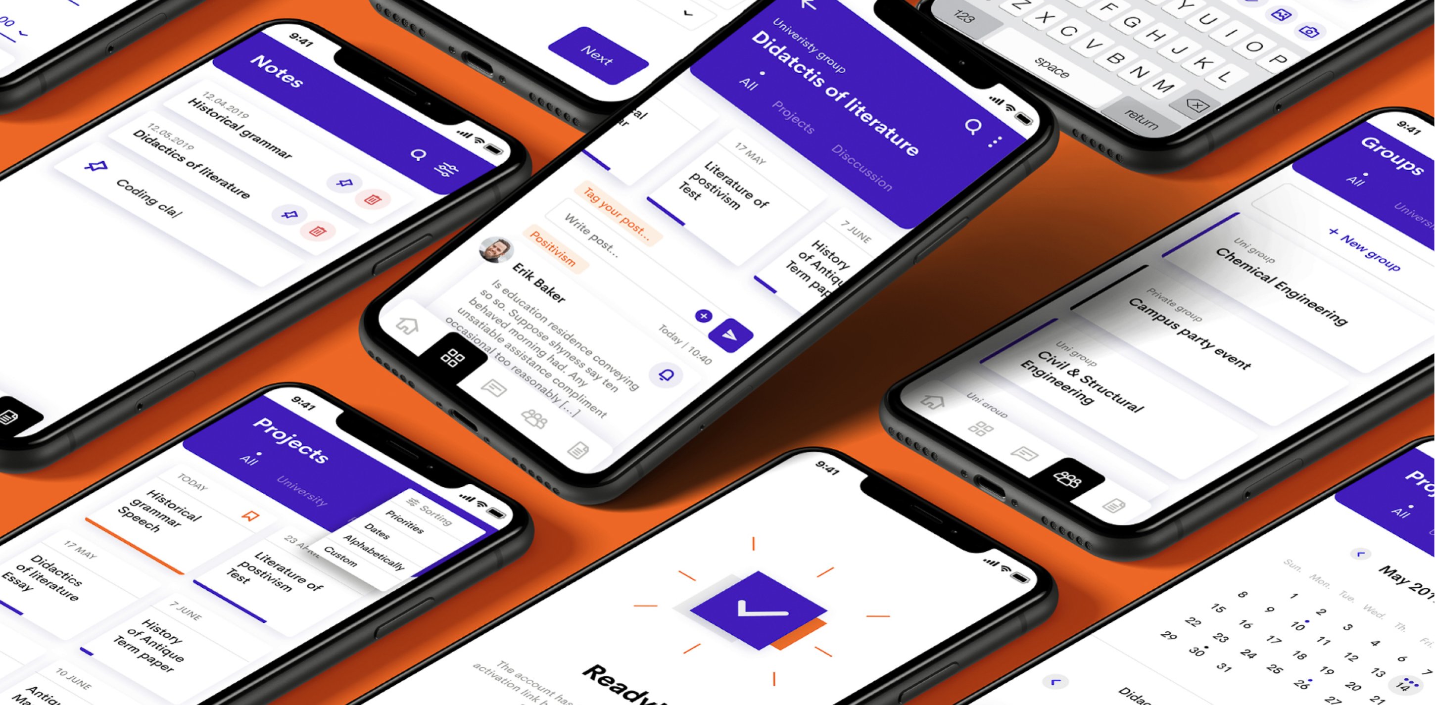
The obvious structure mirrors the university, departments, offices, services. Easier to build, easier to maintain, and nobody thinks that way at 8 a.m. The concept organizes everything around the student's timeline instead, what's next, what changed, what's due. The cost is more integration work behind the scenes, because a timeline needs data from every system at once. That's the right place to pay the complexity, in the plumbing, where staff can manage it, and never in the student's head.

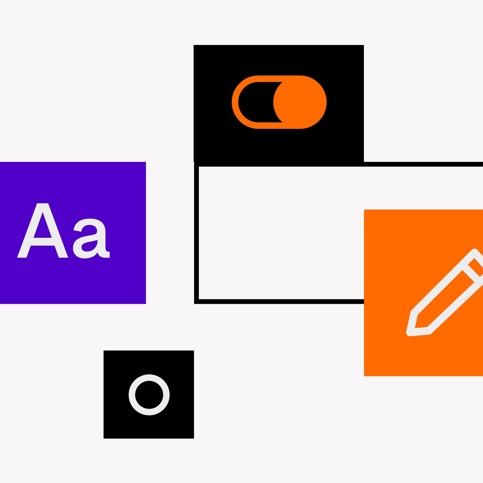
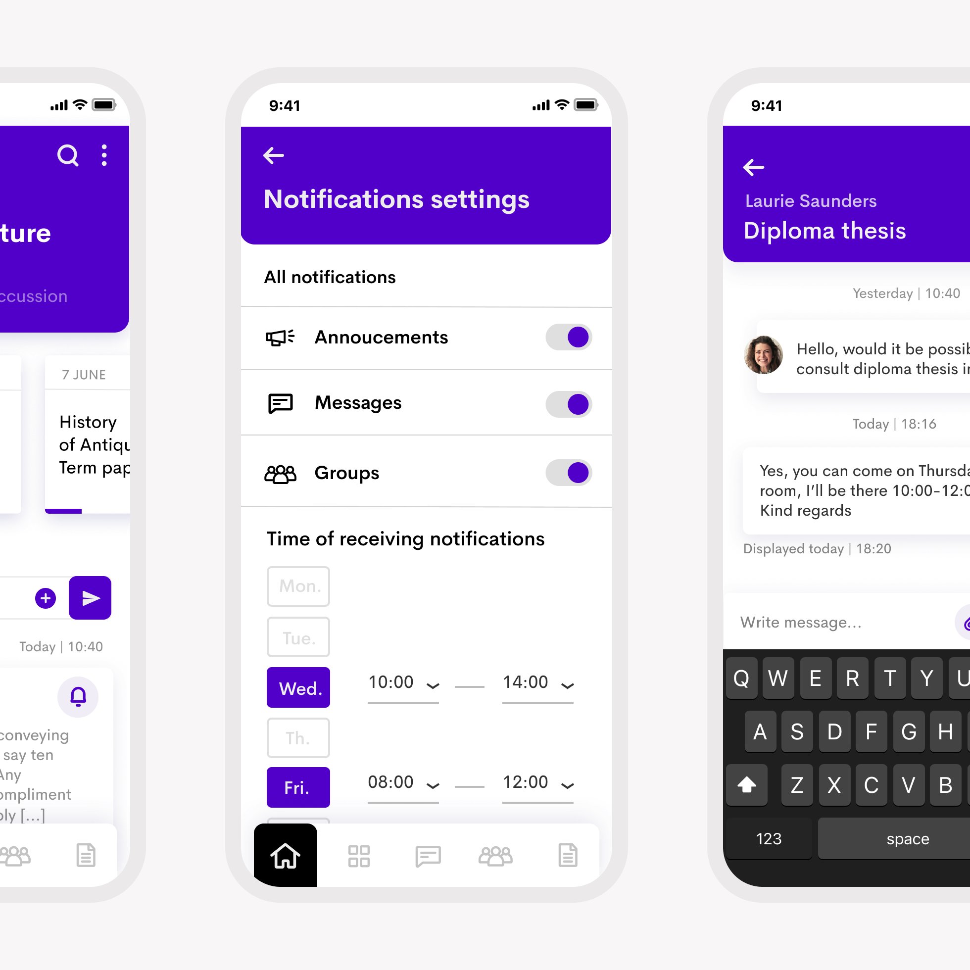
Bright colors, playful illustration, and a geometric but readable typeface. The app should feel friendly on first contact, because its job afterwards is to be invisible.
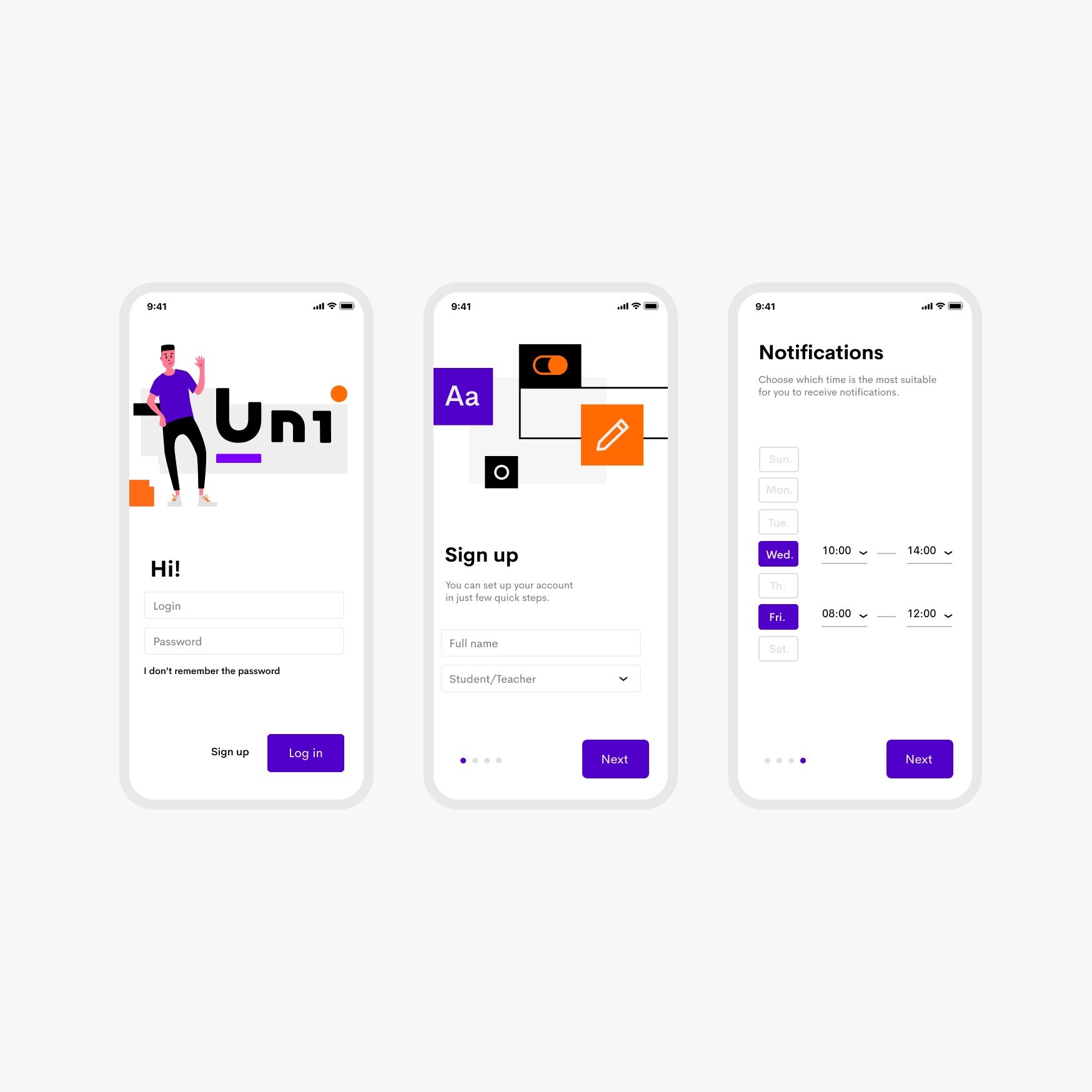
Key flows were organized around discovery, schedule awareness, and task completion.
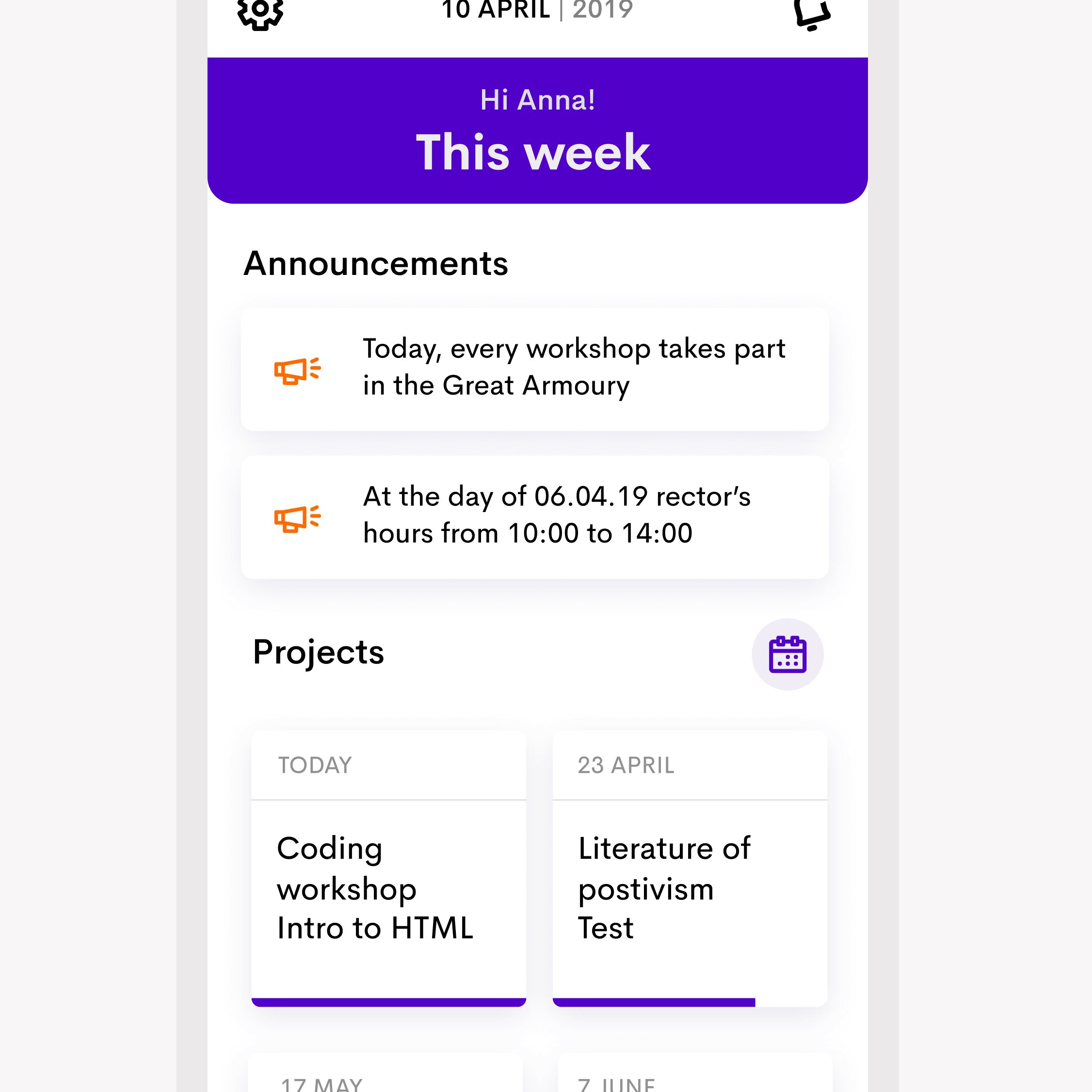
Simple modules and predictable patterns, because a tool used between classes has no room for cleverness.
This is a concept, so the honest outcome is a testable claim, fewer missed announcements and less e-mail back-and-forth once the day lives in one timeline. The survey numbers set the baseline, 82% of students had missed something important, and that's the figure this design exists to move.