I don’t start with screens.
I start with the question behind the brief. Research, strategy, UX, and brand-led design – as one connected effort.
Most briefs describe a symptom, not the real problem. Finding what’s actually broken — and reframing the work around it — is often the most valuable part of any project.
How I approach design
I hold a simple belief. Good design should reduce confusion, not add another layer of complexity.
Many digital products become difficult not because the underlying idea is weak, but because too many decisions remain unresolved. The product says one thing, the interface suggests another, the onboarding assumes too much, and users are left to connect the dots on their own.
My work starts with understanding where complexity comes from. Sometimes it is structural. Sometimes it is strategic. Sometimes it is hidden in language, hierarchy, flow, or expectations. Before moving into polished interfaces, I try to clarify the problem, the journey, and the role the experience should play.
I help teams move from unclear briefs, fragmented journeys, and scattered assumptions into something structured, testable, and easier to build.
Services
Product & UX strategy
Figuring out what the product is, who it's for, and why the current version confuses people. Interviews, journey mapping, positioning. This happens before anyone opens Figma.
Digital product design
Flows, interfaces, and the boring-but-decisive details, what a form asks for, in what order, and what happens when someone gets it wrong.
Brand-led experience
Products where what the brand promises and what the interface does are the same thing. When they drift apart, users notice before the team does.
Design systems
Reusable patterns so the fifth product page doesn't get designed from scratch. Also so developers stop asking which gray this is.
Principles
Strategy before visuals
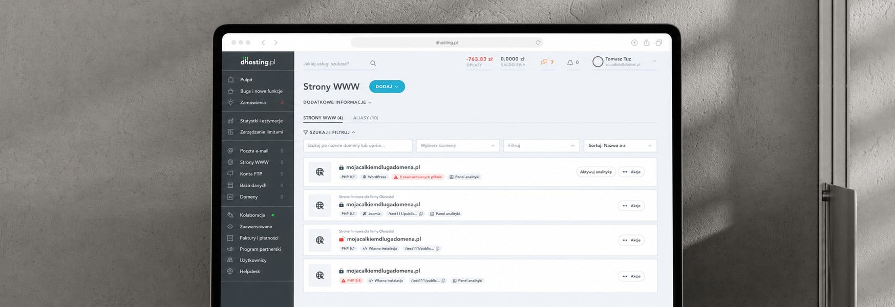
At dhosting I spent the first month on interviews and support tickets before touching a single screen. The screens went faster because of it.
Clarity is a conversion problem
People don't buy what they don't understand. Most of the “UX problems” I've been hired to fix turned out to be comprehension problems wearing a UI costume.
Show, don't hand off
I teach interaction design at the Academy of Fine Arts in Gdańsk. Explaining why a decision is right, to students or to stakeholders, is half the job.
Process
Find what's actually broken
I read support tickets, talk to sales, and interview users before forming an opinion. At dhosting the support team's ticket categories turned out to be a better research tool than my first round of interviews. I found that out later than I should have.
Make it testable fast
A coded prototype beats a debate. I build them with Claude Code, usually within a day or two of having something worth testing, so decisions get made on how people actually click, not on how the meeting went.
Keep brand, product, and UX in one conversation
These usually live in three teams that meet quarterly. The product suffers in the gaps between them. Part of my job is being the person who has read all three roadmaps.
Check whether it worked
Shipping is not the end of the project. I look at what changed, fewer tickets, better completion, faster time to first value. When nothing changed, that's information too.
How AI fits into this
This part changed my job more in two years than anything in the previous six.
The short version, my design system lives in Figma, Claude Code builds against it, and prototypes go straight to code. The full setup, including where AI genuinely saves me time and where it only feels fast, has a page of its own.
“If you’re looking for someone to simply turn requirements into mockups, you’re missing what he does best.”