Make the program legible
A visitor should find the current exhibition and the opening hours without using search.
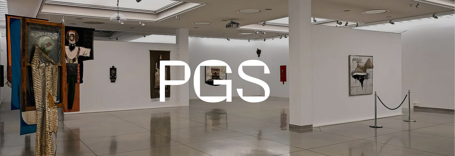
Brand-led digital experience for the State Art Gallery in Sopot.
PGS, the State Art Gallery in Sopot, needed its program to be readable on the web, what's on now, what's coming, and how to plan a visit. Credibility was the second requirement, and for a cultural institution credibility is mostly structure, hierarchy that answers questions in the order visitors actually ask them.
A visitor should find the current exhibition and the opening hours without using search.
A public gallery earns trust through order, exhibitions, archive, and practical information, each in its place.
Every new exhibition means new subpages. Coherent sections keep them consistent without a designer in the loop each time.
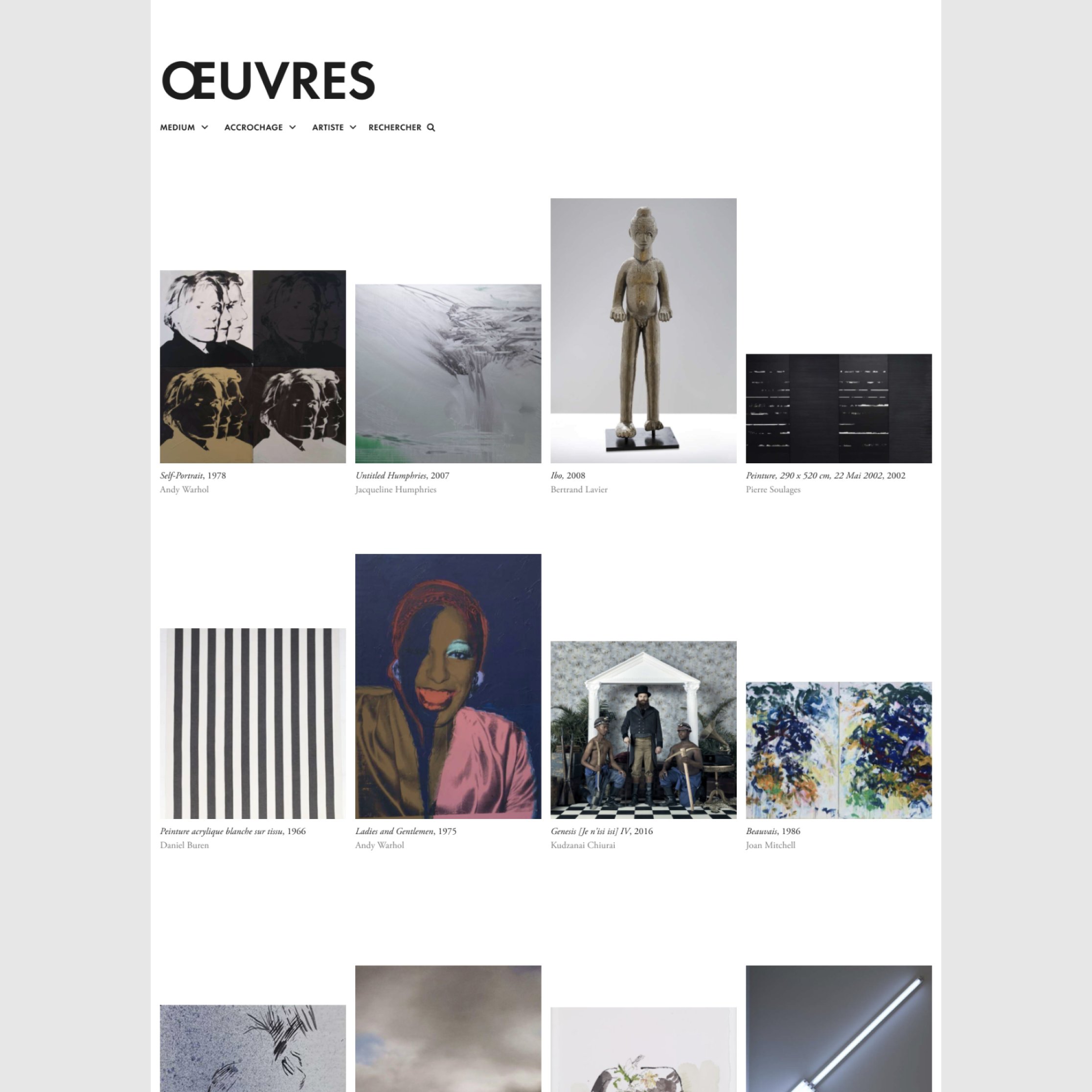
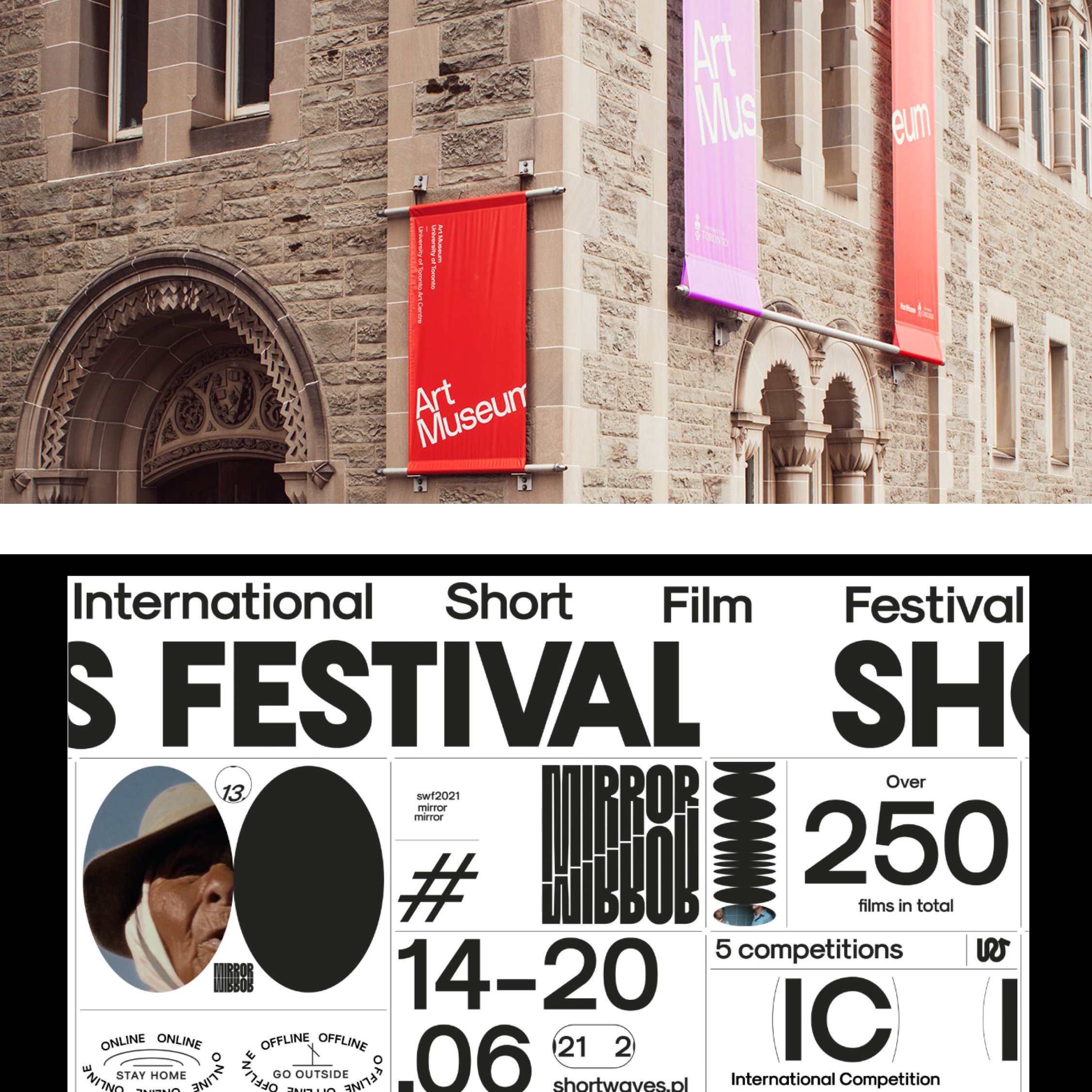
Cultural institutions sit in an odd spot, they have to look serious to the established art audience and approachable to someone planning a Saturday visit. Before designing anything I collected how the strong ones handle it, museum sites, festival identities, the visual language that signals "institution" without signaling "bureaucracy".
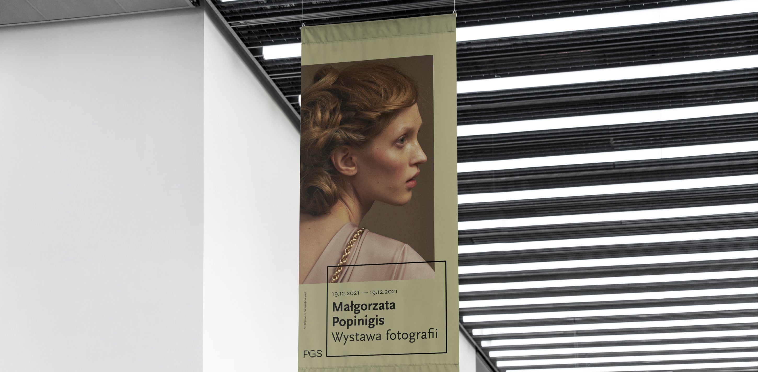
The identity is built from a short and a full-length logotype plus a set of adaptable layouts, so the gallery can produce posters, banners, and social formats that look related without being identical. It has to work on a building facade and in an Instagram square with the same confidence.
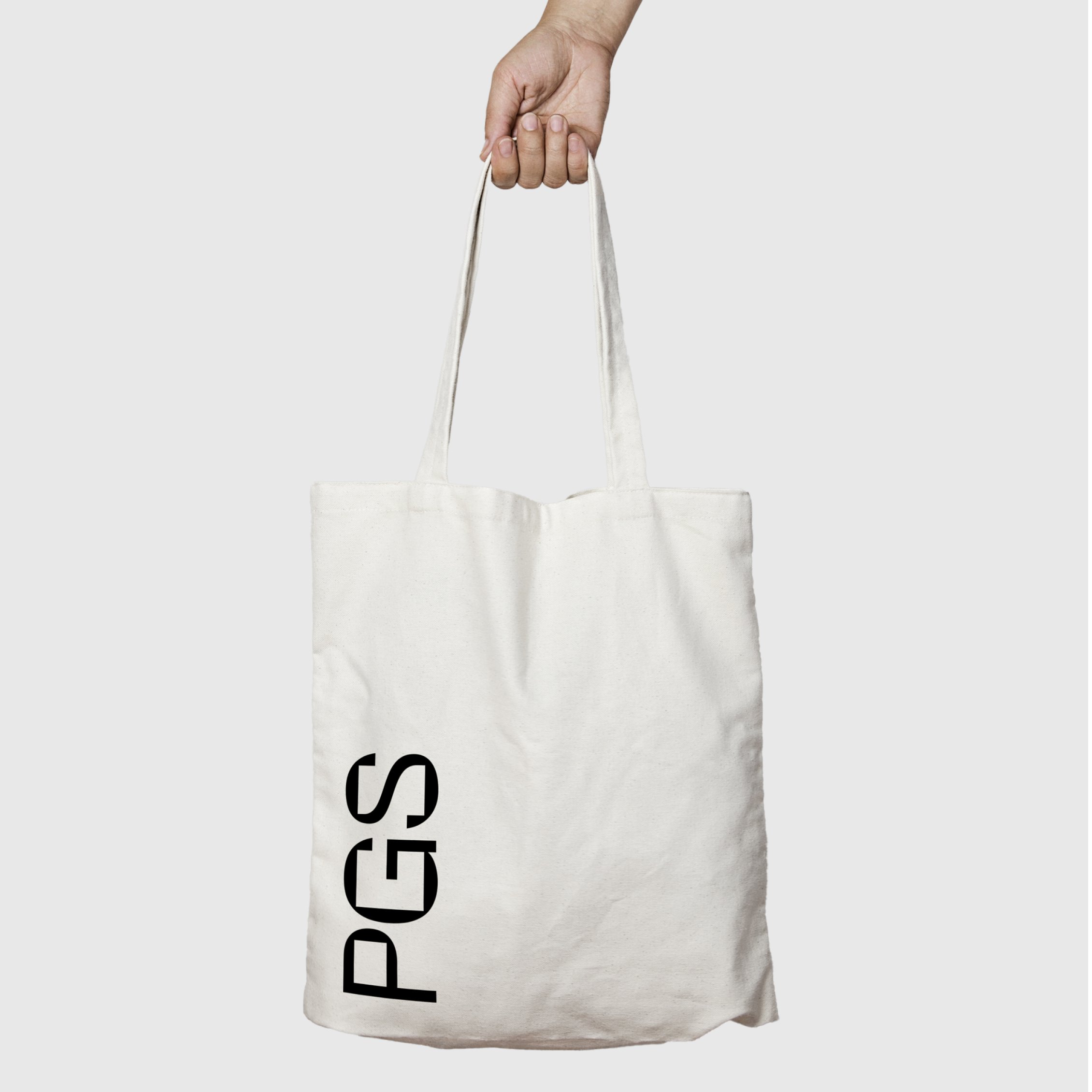
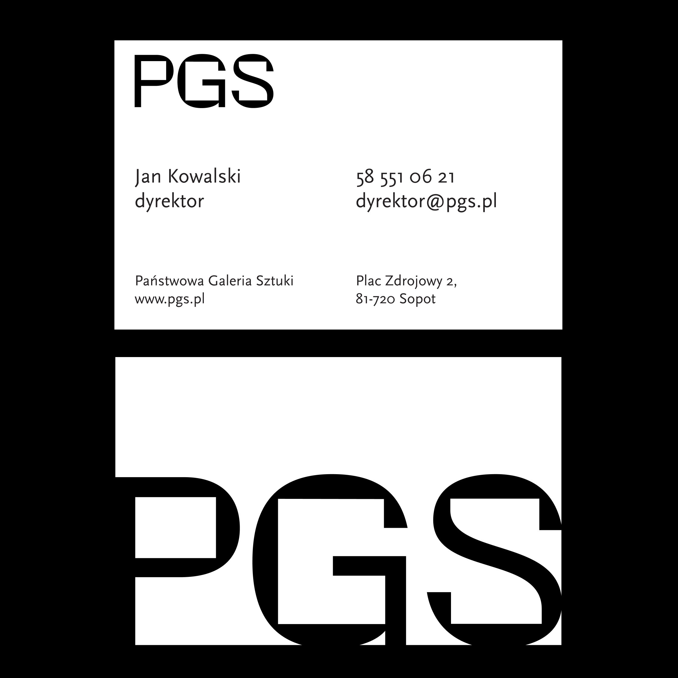
The dynamic identity generates formats for digital and print alike, exhibition posters, catalogs, merchandise. The system does the consistency; each exhibition brings its own artwork.
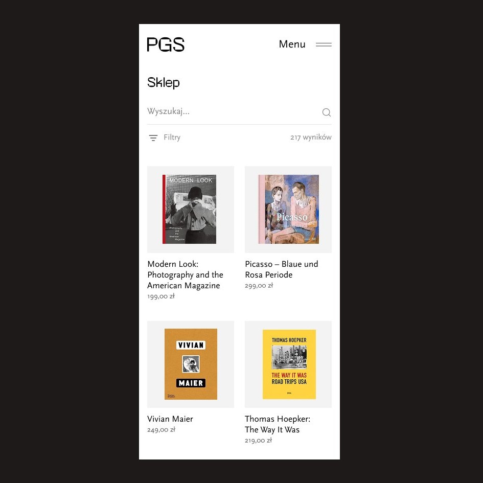
The site was designed as a set of reusable sections rather than finished pages. Less glamorous, and it means the tenth exhibition page looks like it belongs to the same site as the first, without a designer in the loop each time. The trade-off is fewer bespoke moments. For an institution whose credibility lives in consistency, that's the right trade.
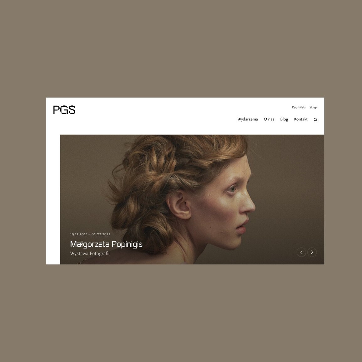
An exhibition page answers the visit questions first, what, until when, where, how much.
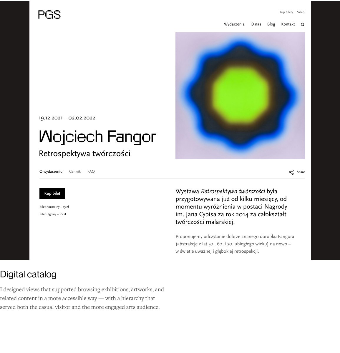
Reusable layouts keep the experience coherent as exhibitions and events get added.
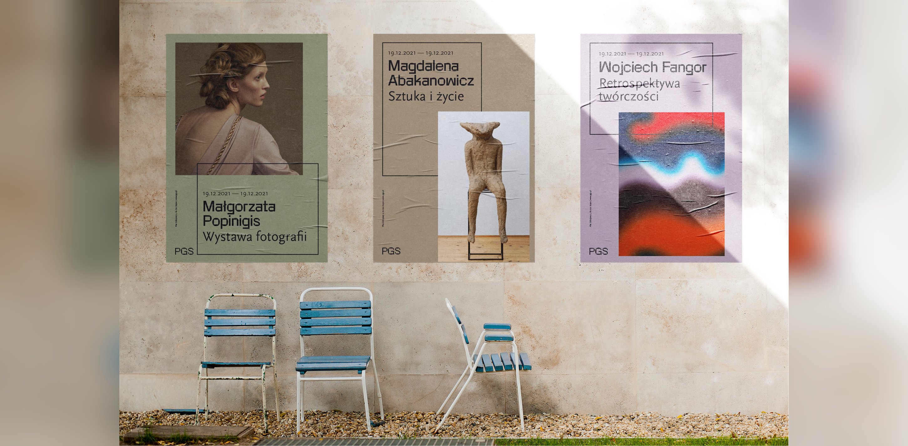
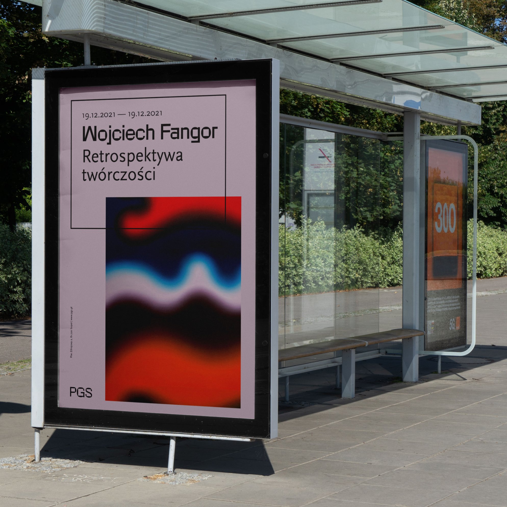
The gallery got a system it can run itself. Each new exhibition brings its own artwork, drops it into the shared layouts, and comes out looking like part of the institution, on the website, on a facade banner, and in an Instagram square. A visitor planning a Saturday finds what's on and when without using search, which was goal number one.