Immersive, not decorative
Layouts, typography, and motion in service of one impression, this label knows what it's doing.

An immersive web experience for a music catalogue.
Universal Music Poland needed a website that could sit next to the global UMG brand without disappearing into it. The audience was narrow, artists and their managers deciding whether this is a label to sign with. The site had to read as an industry leader to people who see industry-leader websites every week.
Layouts, typography, and motion in service of one impression, this label knows what it's doing.
The primary reader was an artist or a manager, not a fan. Every page had to answer their question, what would UMG do for me?
Stay recognizably UMG while giving the Polish branch its own character.
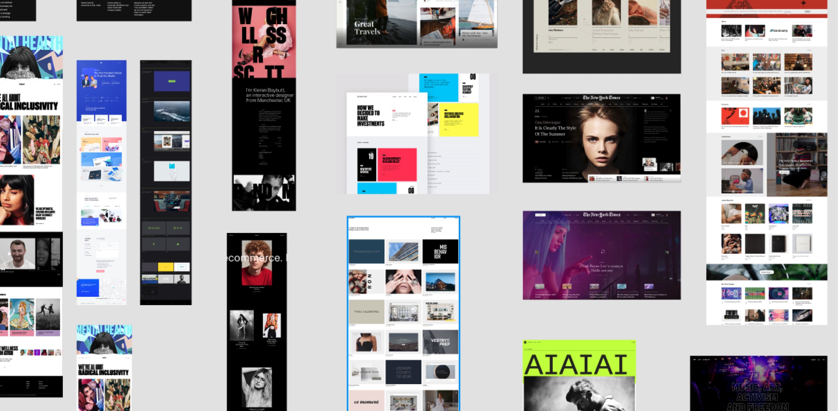
UMG runs dozens of country sites, and they don't agree with each other. I went through them to find where the brand was strongest. The Swedish, German, and Finnish sites came closest, bold typography, minimal UI, strong imagery. That became the reference point, and the gap between those sites and the Polish one became the brief.
Between coherence with the global brand and a distinct local personality, we split the difference deliberately, structure and hierarchy follow the global family, while imagery, motion, and tone belong to Poland. A visitor from the Berlin site should feel at home. A Polish artist should feel addressed.
The strongest country sites set the bar for typography and imagery, so the Polish site was designed to pass for one of them at first glance.
Animation is where "immersive" either earns its name or turns into noise. Each animation had to direct attention somewhere, or it got cut.
The visual rule was bold but clean, oversized type, dark surfaces, and imagery doing the talking. Every element on the page is something you can interact with, and the subtle animations exist to make that interaction feel smooth, not to decorate it.
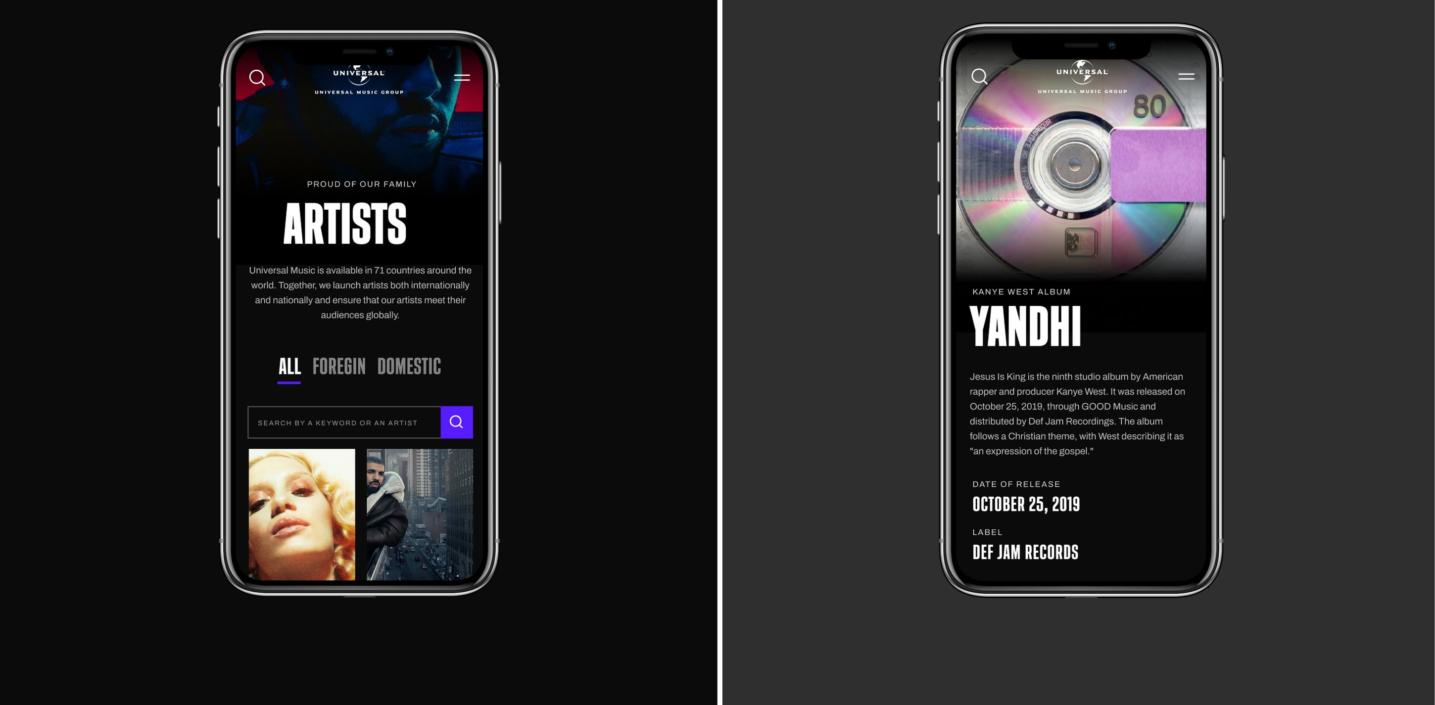
The Polish site now holds its own next to the strongest UMG country sites, the Swedish, German, and Finnish ones that set the bar in the research. That was the brief, a label page an artist or a manager can look at and take the company seriously, at first glance and on the second read.