Lower the barrier to entry
Create a concept that feels accessible to people starting online while still remaining useful for more advanced users.

A hosting product for people who think hosting isn't for them. Designed from zero and launched internationally.
mybox started from an observation in the research, a large group of people assume hosting is not for them. Too technical, too many acronyms, built for someone else. The brief was to design a product for exactly those people, from zero, including what it would be called and how it would earn money.
Most hosting products are built for people who already know what they need. mybox was designed for everyone else, people for whom starting online feels uncertain, overwhelming, or simply not meant for them.
Create a concept that feels accessible to people starting online while still remaining useful for more advanced users.
Get users to the first visible result faster, so the product proves itself before the doubt returns.
Compete with website builders and social platforms, since that's where this audience actually goes first.
The fastest way to understand mybox is to watch it. The showreel walks through the concept, the onboarding, and the store, everything the rest of this page unpacks.
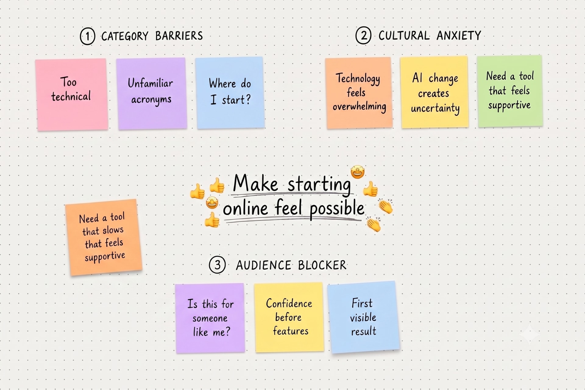
To understand the opportunity, I combined category analysis, cultural research, and audience blocker mapping. One pattern kept coming back. The category mostly ignores its biggest adoption barrier, how the product makes people feel about their own ability to succeed. Price and features came second in every conversation.
Most offers in the category communicated in a way that assumed prior knowledge, creating distance for everyone else.
Themes like technology overwhelm and anxiety around AI-driven change showed that people wanted tools that felt like they were on their side.
I mapped first-time creators, web professionals, and e-commerce users, each with different blockers and expectations. For the core audience the blocker wasn't confusion about features. It was a deeper uncertainty, is this even for someone like me?
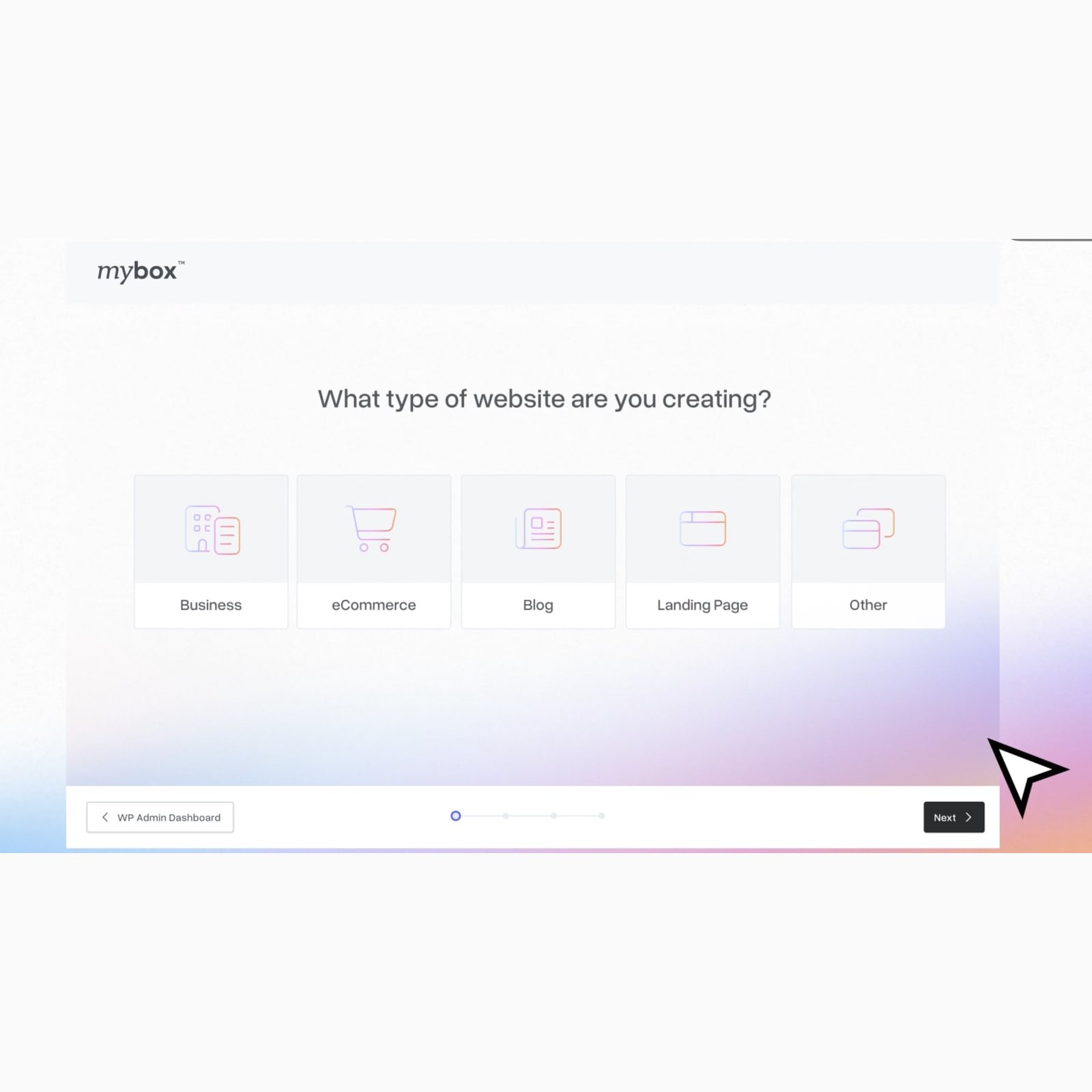
mybox took shape as a modular ecosystem for building an online presence, and the shape of that ecosystem came down to one call. The category default is to make people configure everything upfront, which is exactly what scares off the audience mybox was built for. We designed it the other way around, sensible defaults first, add-ons when a real need shows up. The cost is a smaller initial basket. The bet was that a user who feels capable comes back and grows, and a user who feels stupid never returns to grow at all.
The free plan is not a stripped-down teaser. It gives people enough room to start, see progress, and decide for themselves when more capability will be useful.
Modularity became a simple mental model. People can combine what they need without first having to understand a hosting taxonomy or commit to a complex package.
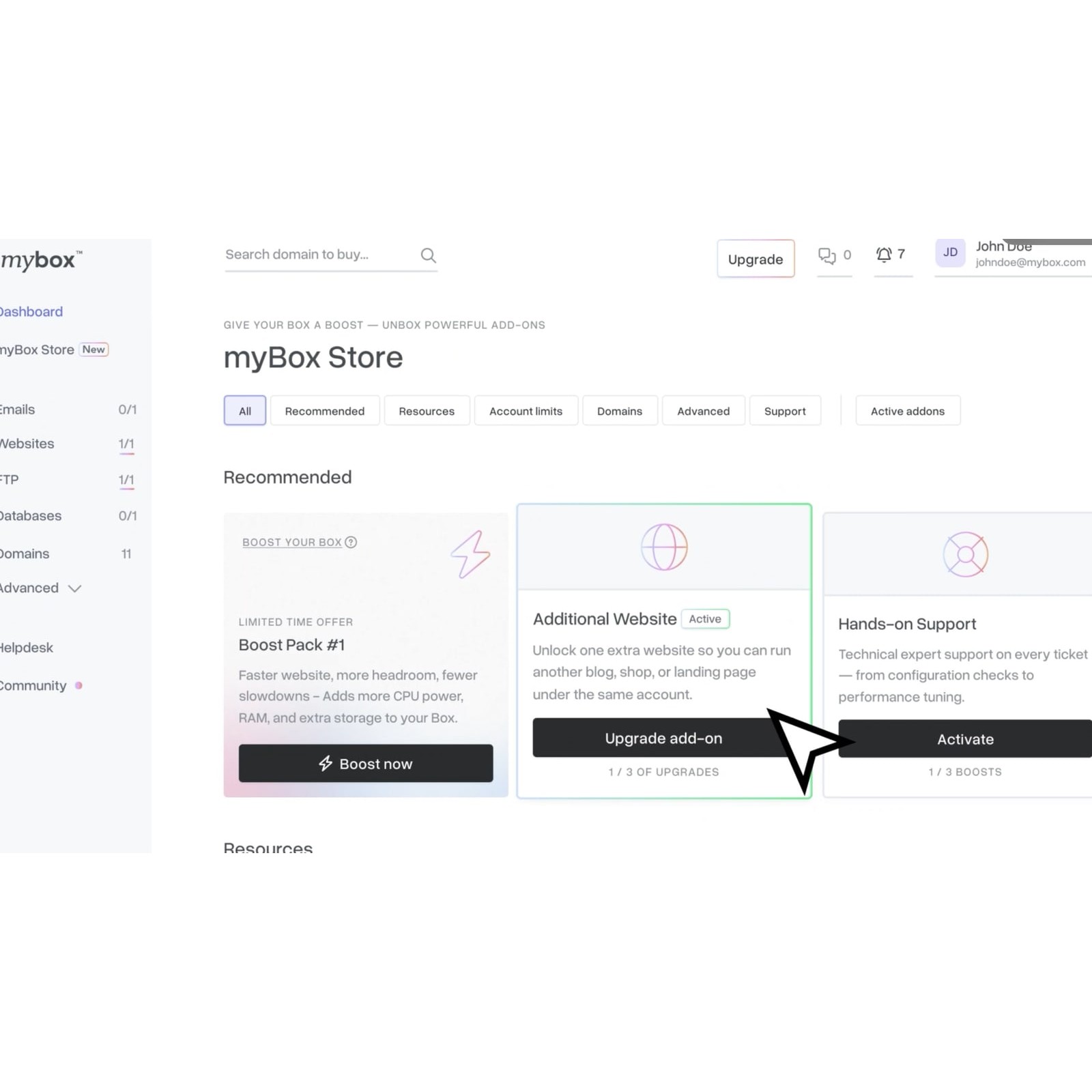
The add-ons model grows with the user instead of front-loading choices. The store makes the next practical option visible without turning every visit into a sales funnel.
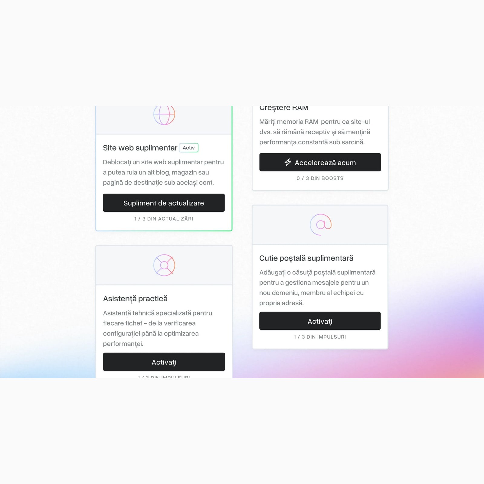
The visual language, motion, and design system foundations were shaped to feel warmer than the category average, so even a resource limit reads as a friendly nudge rather than an error.
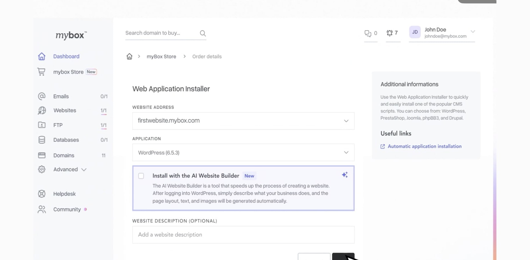
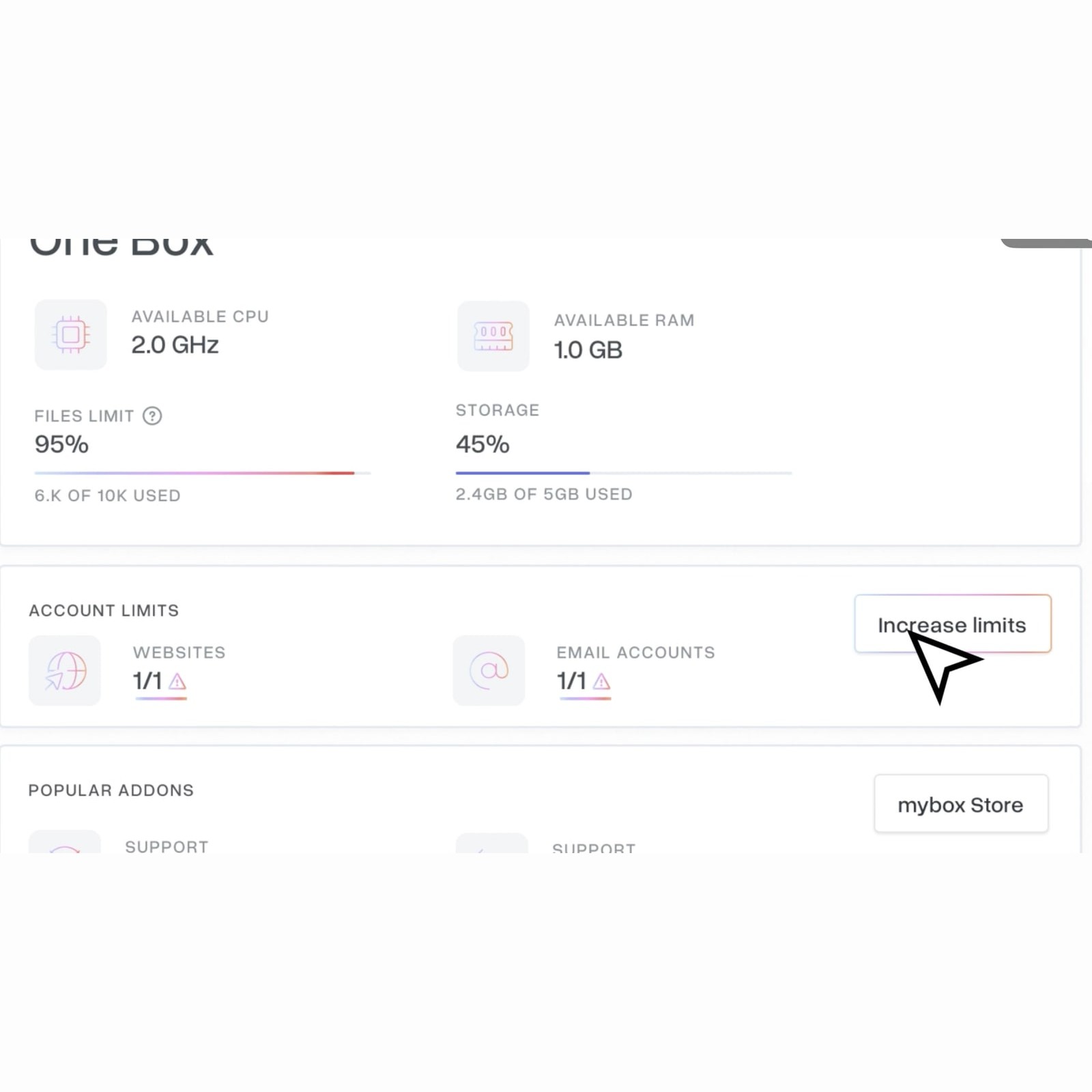
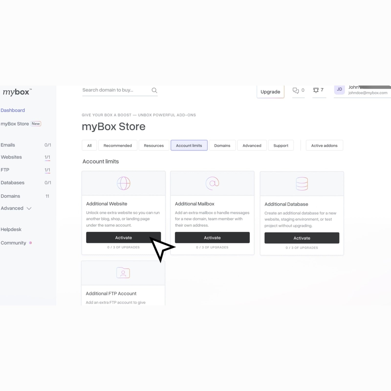
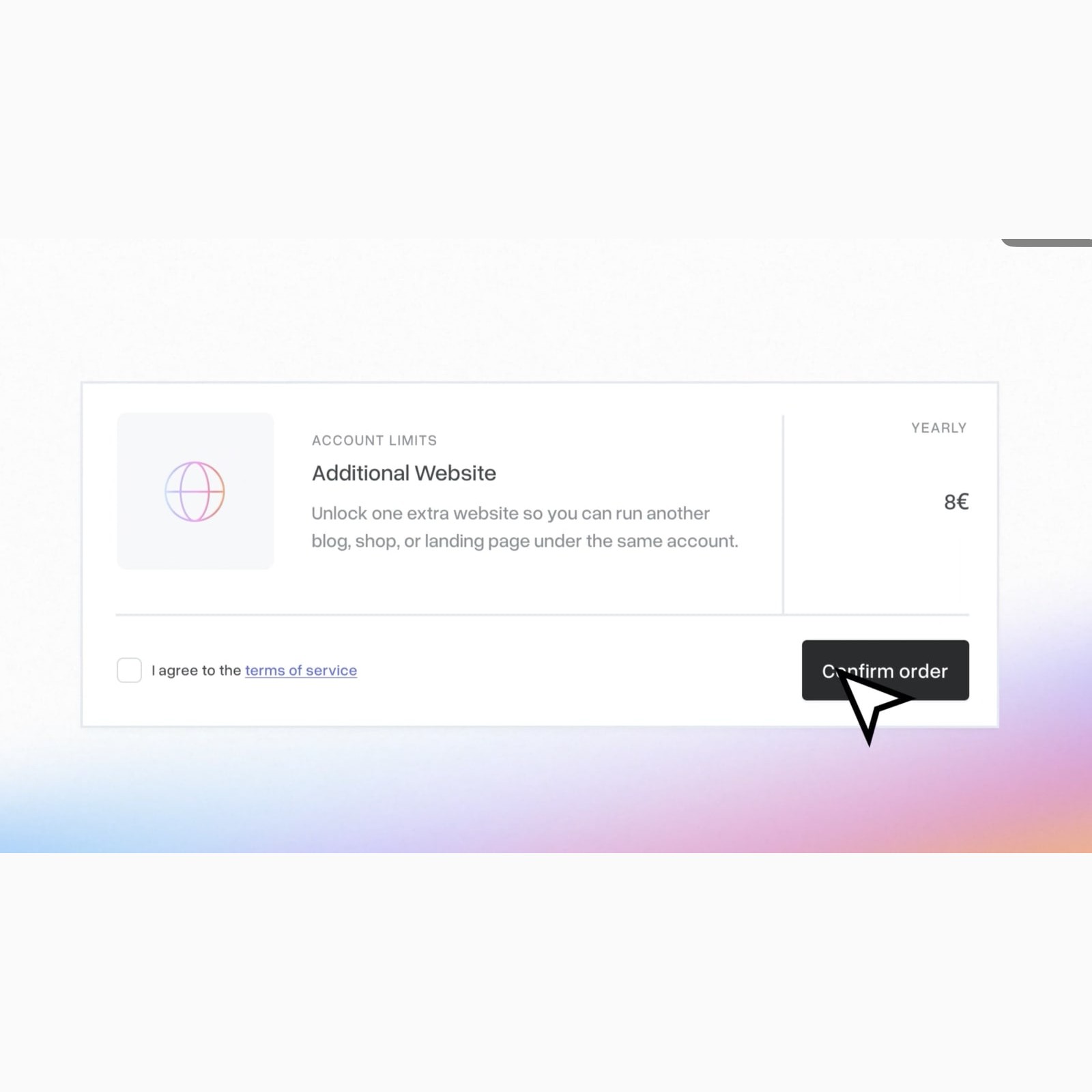
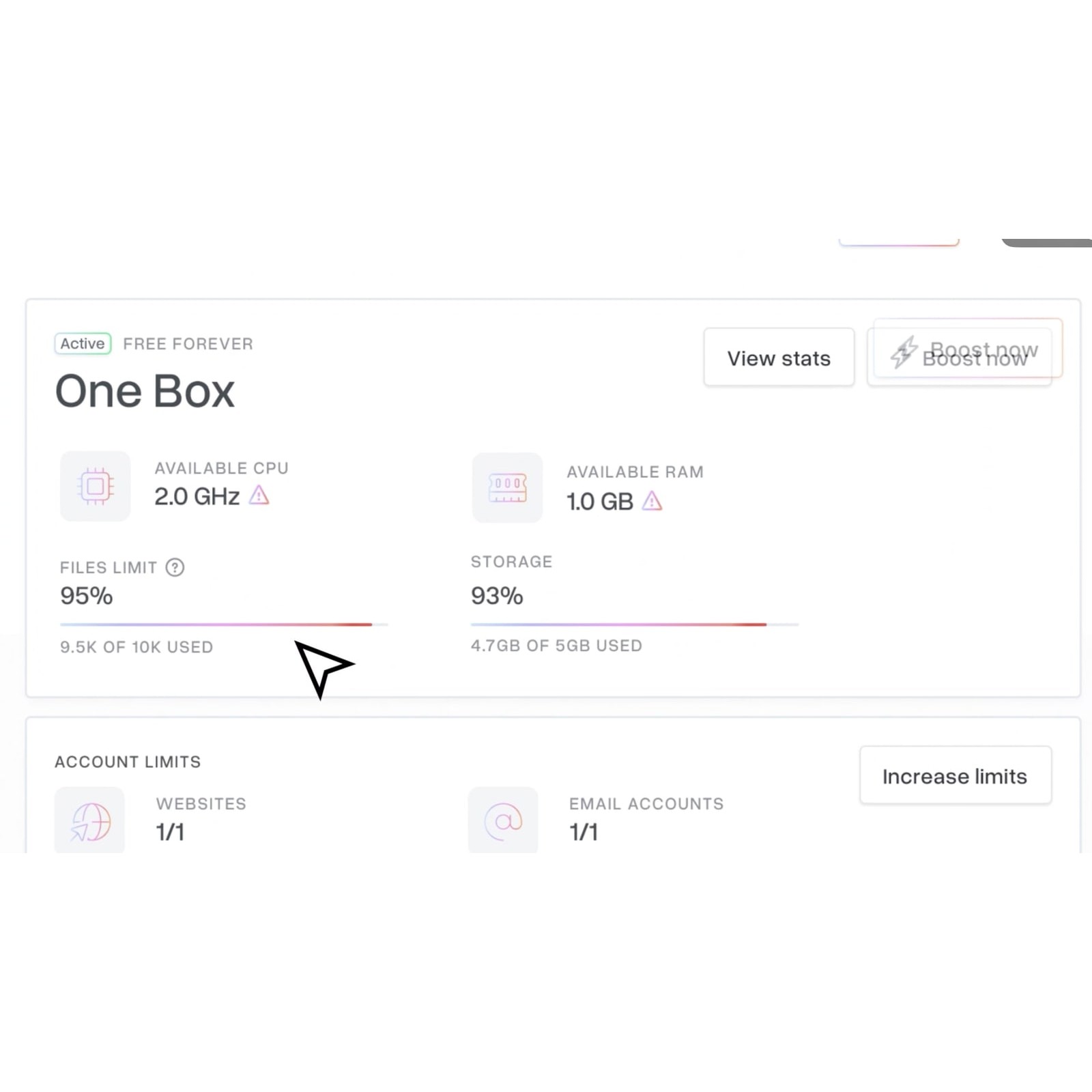
Capacity warnings and upgrades appear in the context of real work, not as a technical obstacle. The language is deliberately concrete, so people know what they gain before they decide to pay for it.
When the account reaches a limit, the next step is framed as a small, tangible improvement. The product stays clear as a user's needs become more advanced.
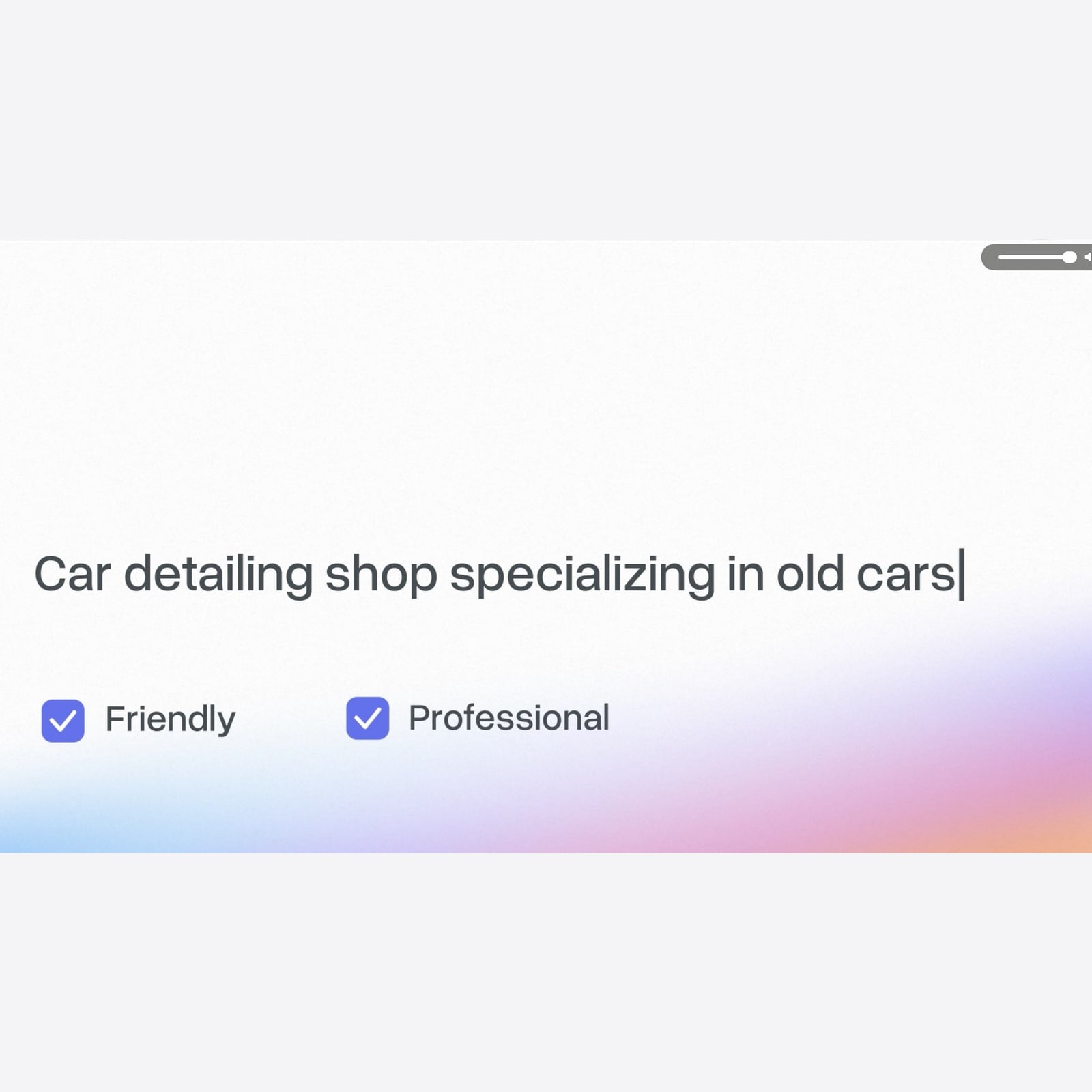
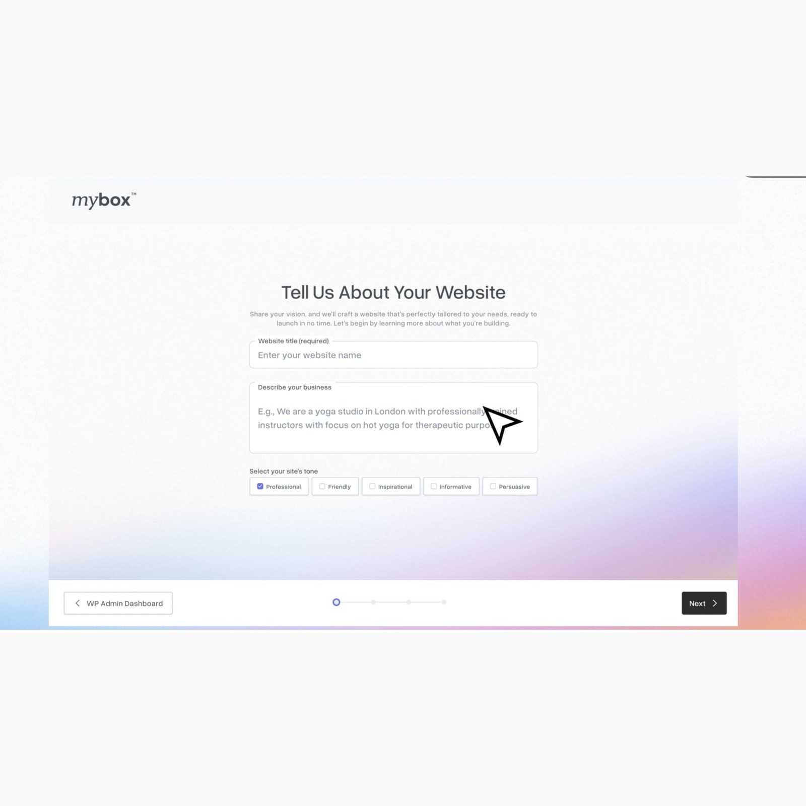
The AI-led flow starts from a description of the business, not a hosting taxonomy. People say what they want to make, and the product carries the technical setup, generating a first version they can react to instead of a configuration they have to decode.
mybox launched internationally and picked up users faster than we planned for. My takeaway from this one, in a mature category everyone has roughly the same features, and the product that wins is the one that makes people feel capable.