Make the offer make sense
A customer should be able to say what the product does and which plan fits them without calling support.
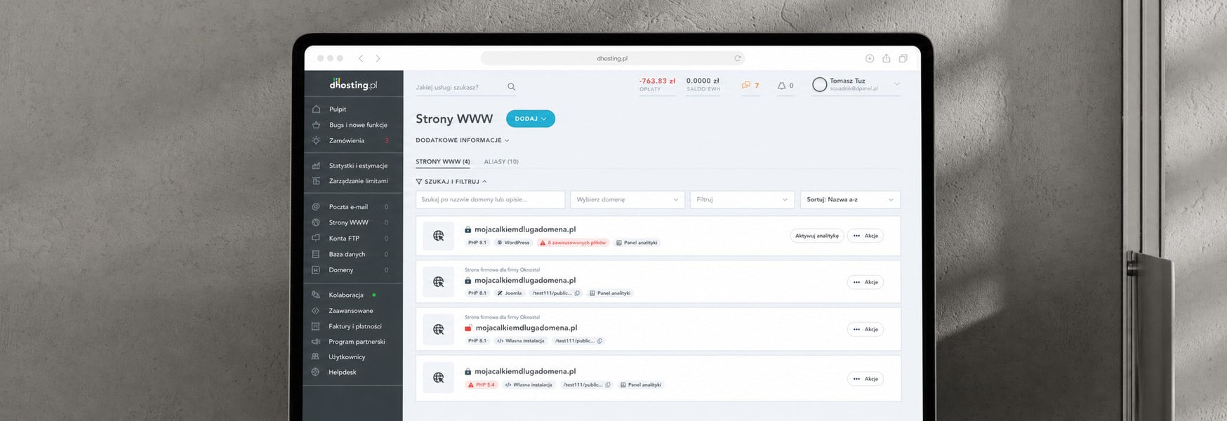
Hosting is hard to buy. My job was making the offer understandable, from the website through sign-up to the panel.
dhosting sells hosting, which means selling something most customers don't fully understand. People weren't leaving because the interface was bad. They were leaving because after five minutes on the site they still couldn't tell which plan was for them. That was the problem I was hired into, and it ran deeper than the website, through sign-up, the cart, onboarding, and into the product panel.
A customer should be able to say what the product does and which plan fits them without calling support.
Sign-up, cart, onboarding, and the migration form. Each one was leaking users at a measurable point.
Sales and support talked to confused customers daily. None of that knowledge was reaching design decisions. My job was partly plumbing, connecting those pipes.
I ran in-depth interviews focused on one gap, what users thought the product was versus what it actually did. Then surveys to check whether the patterns held at scale. The most useful source turned out to be the least glamorous one. Support's ticket categories were a ready-made map of confusion, sitting there for years, used by nobody on the product side.
Users who couldn't explain the offer back to me in interviews were the same profile that dropped off before checkout.
Users weren't missing information. They were drowning in information that wasn't for them.
The website, the transactional flows, and the panel had grown separately for years. The product people bought didn't feel like the product they'd been sold.
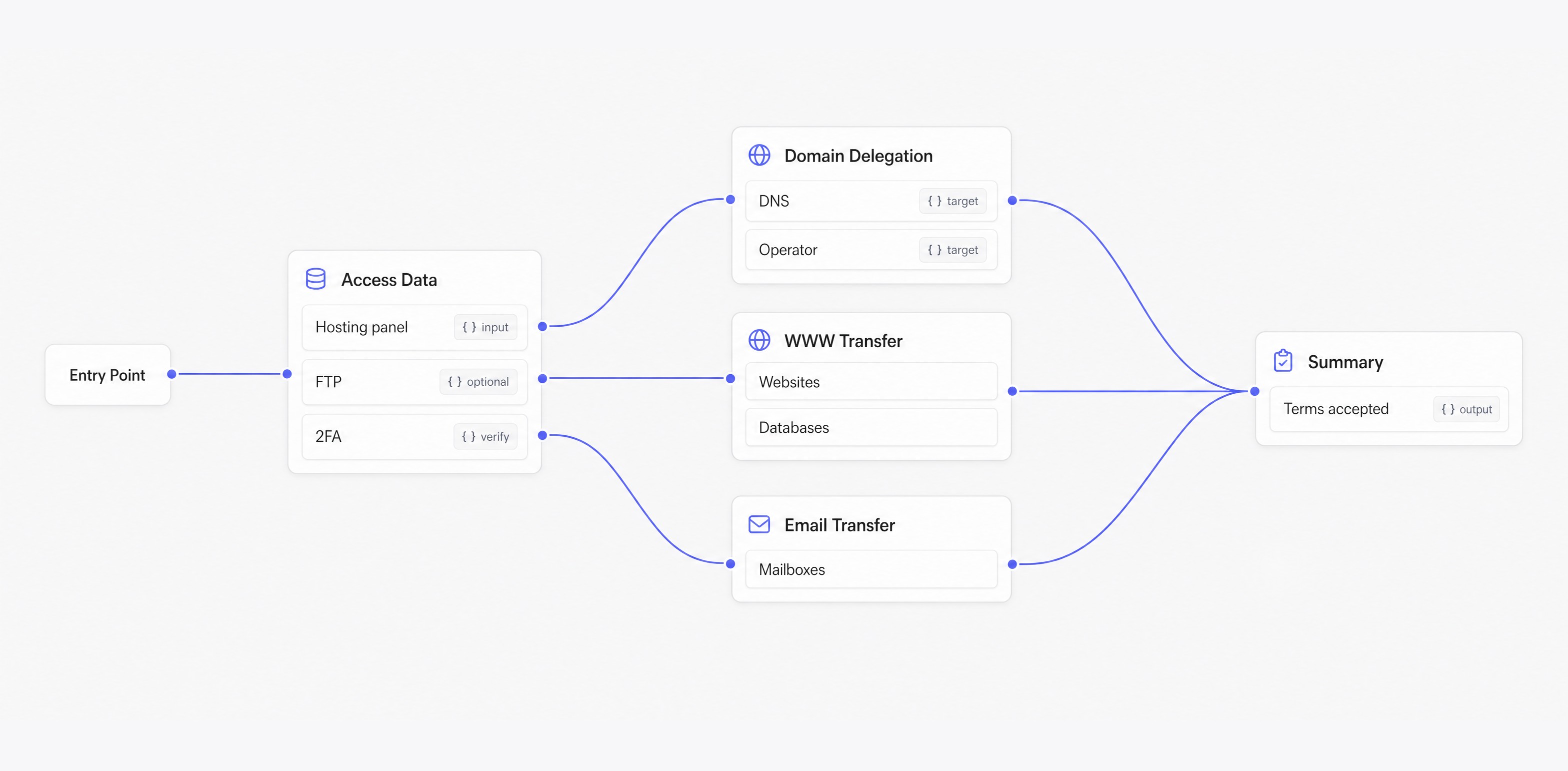
The first journey rebuilt on that research. Support tickets showed exactly where migrations failed, so the form was redesigned around the errors people actually made. Fewer fields visible at once, technical inputs explained at the point of entry. The goal was fewer failed migrations and less support time per request.
The clearest example of how I work through a decision. Research showed users signing up, hitting a wall of technical configuration questions, and stalling before reaching any value.
Keep the linear setup, rewrite the copy, add tooltips. Cheapest, fastest, and it treats a structural problem as a wording problem. Users weren't confused by the labels. They were being asked questions they couldn't answer yet.
Let users click through pre-selected choices. Fast path to "done", but it produces accounts their owners don't understand, and that debt comes back as support tickets a month later where nobody connects it to onboarding.
Start everyone with sensible defaults and surface each configuration decision at the moment it becomes relevant. The most expensive option, and it needed a stakeholder argument, because asking less upfront looks like dumbing the product down.
We picked three criteria before picking a winner, time from sign-up to first meaningful action, support load per new account in the first month, and whether the pattern would survive new products without a redesign. Option one failed the first criterion, option two failed the second. We built option three.
Power users lose some speed early on. Research showed they self-served through documentation anyway, while the users we were losing were the ones the wizard was failing. We chose the struggling majority over the vocal minority, out loud, in a meeting.
Bring support in two weeks earlier. Their data was better than my first interviews and I found that out late.
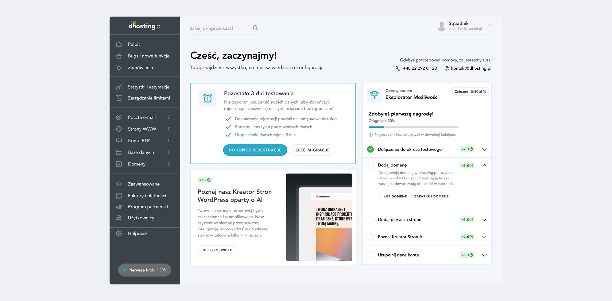
The pattern we chose shows up here. Everyone starts on sensible defaults, and the setup comes back as a short, guided checklist, so a first session ends in progress instead of a wall of configuration.
Onboarding and the migration form were two threads. The rest of the work ran on the same logic, from how the offer is framed to how the panel behaves when something needs attention.
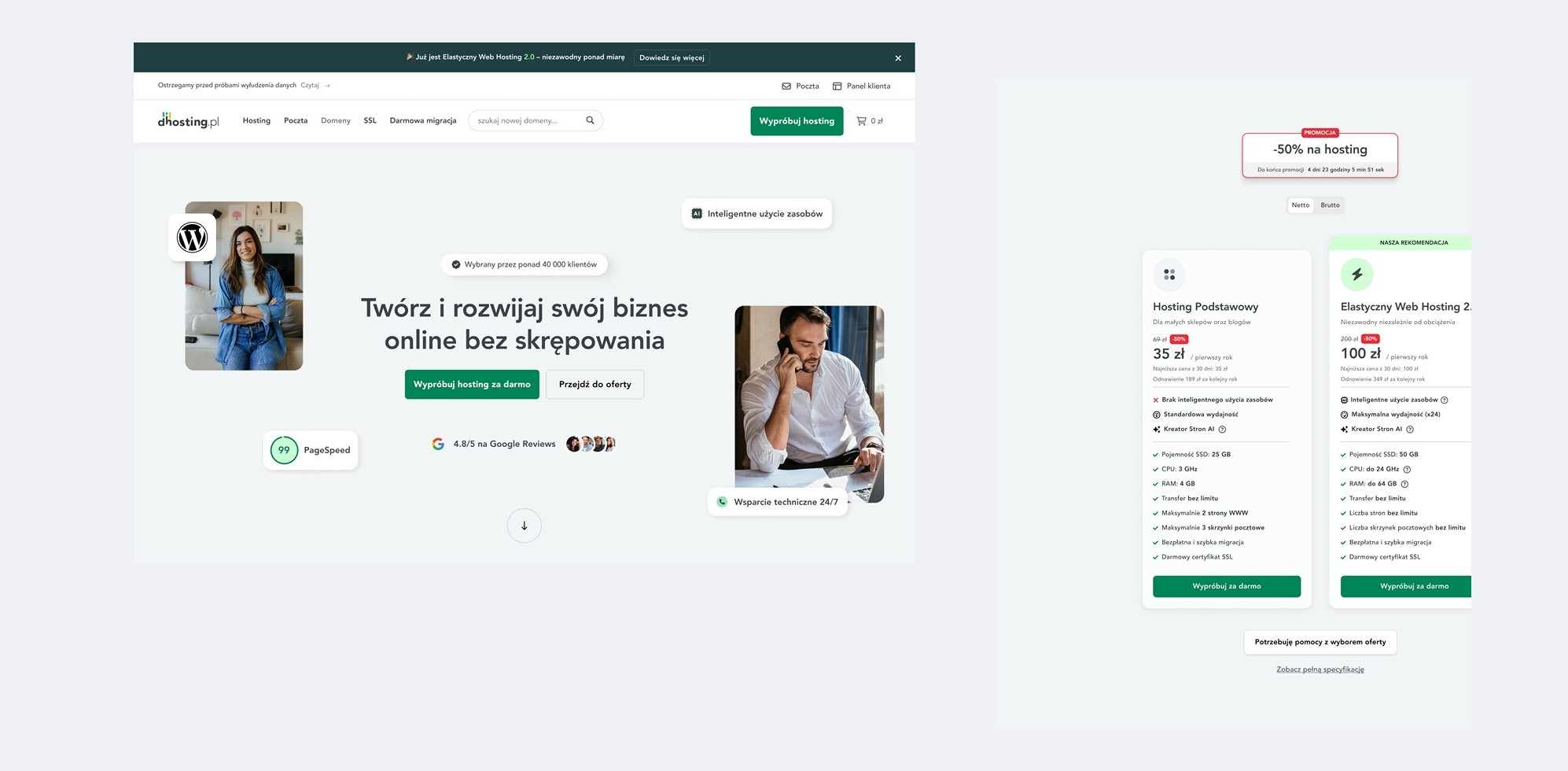
The product range got restructured around the questions customers actually asked, with the strategically important offers surfaced first instead of buried in a comparison table.
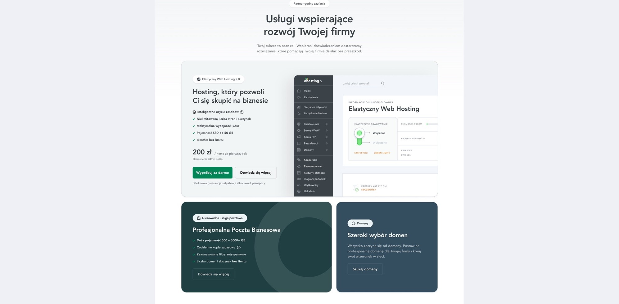
Supporting services sit behind the same logic as the plans, framed by what a customer is trying to do rather than by what the feature is called.
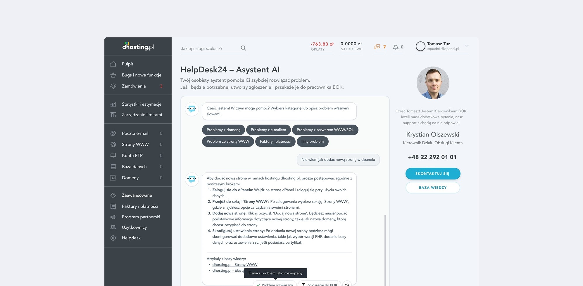
HelpDesk24 answers the common questions in the panel and hands off to a real person the moment it should, so a confused customer gets unblocked without the queue that comprehension problems used to create.
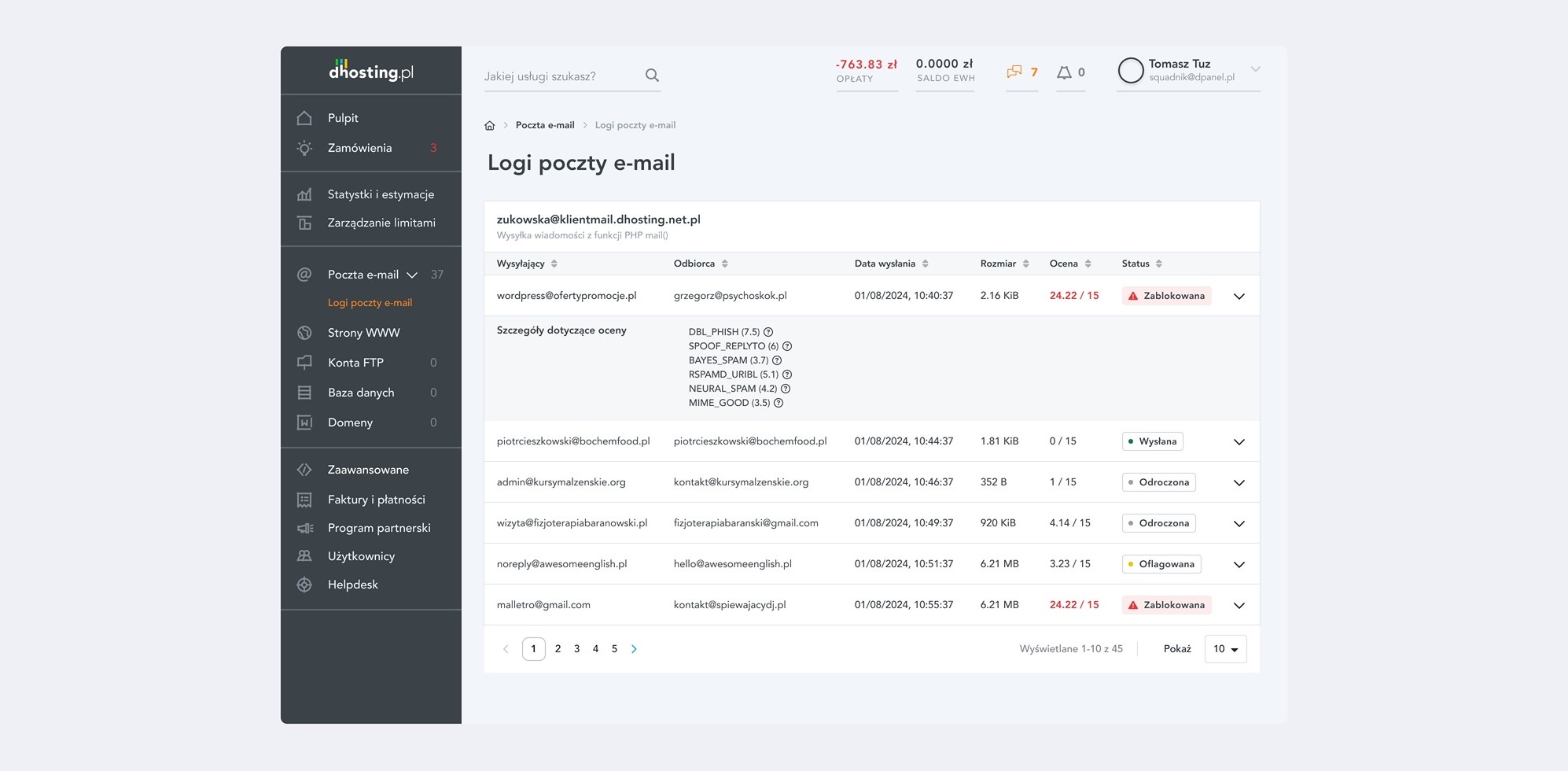
Where the product used to stay silent, it now shows its work. Email delivery logs, for one, surface exactly what happened to a message, so a user can see the cause instead of opening a ticket to find out.
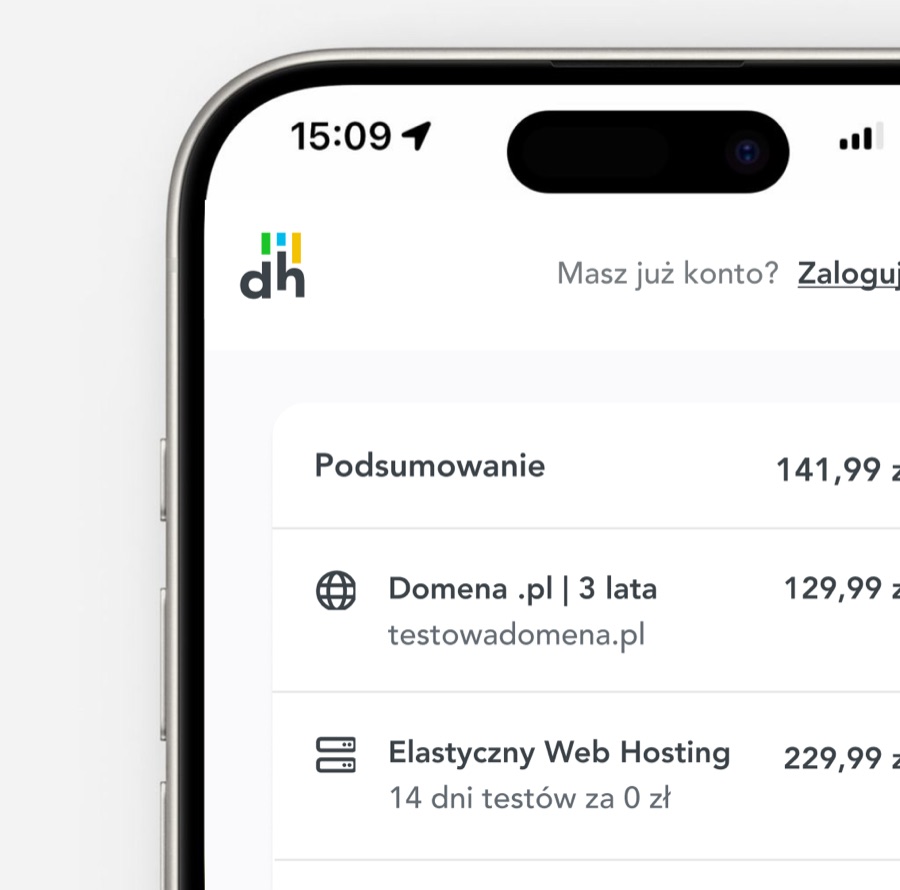
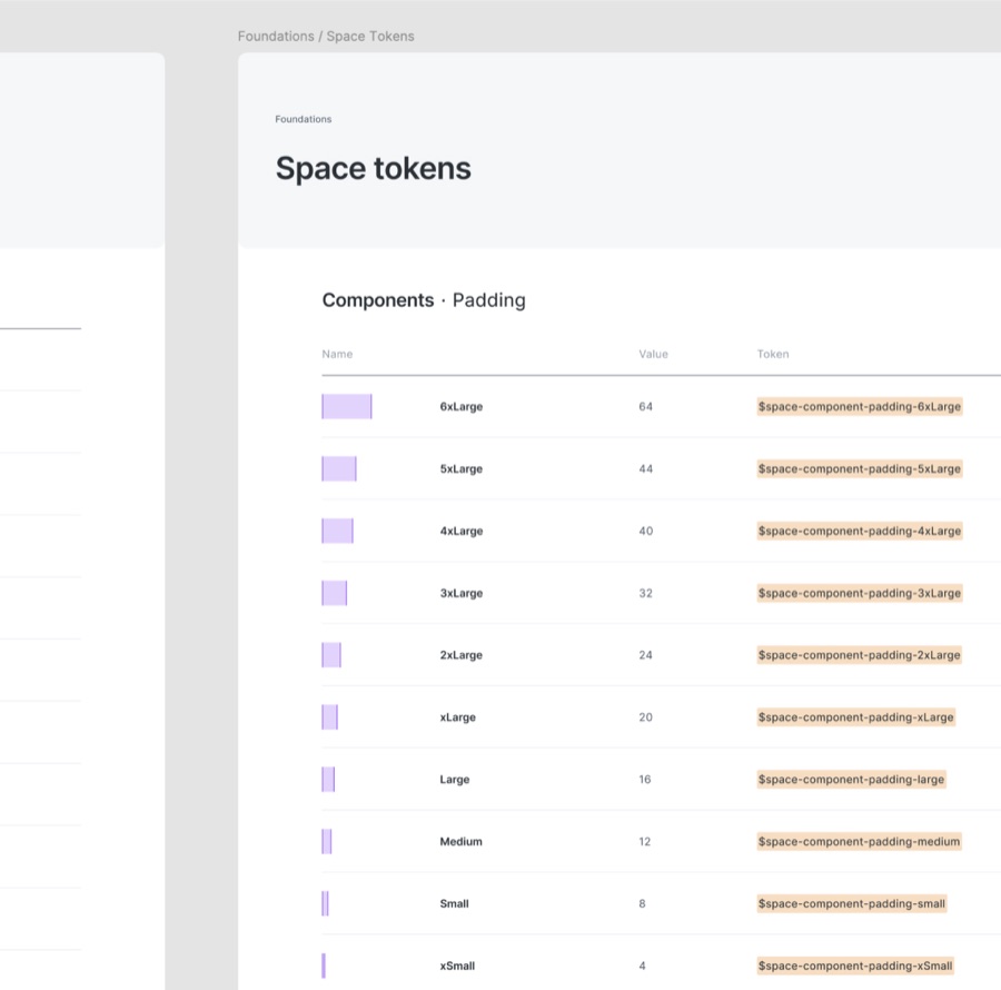
Reusable patterns across the acquisition experience, so handoff to development stopped being a negotiation about spacing.
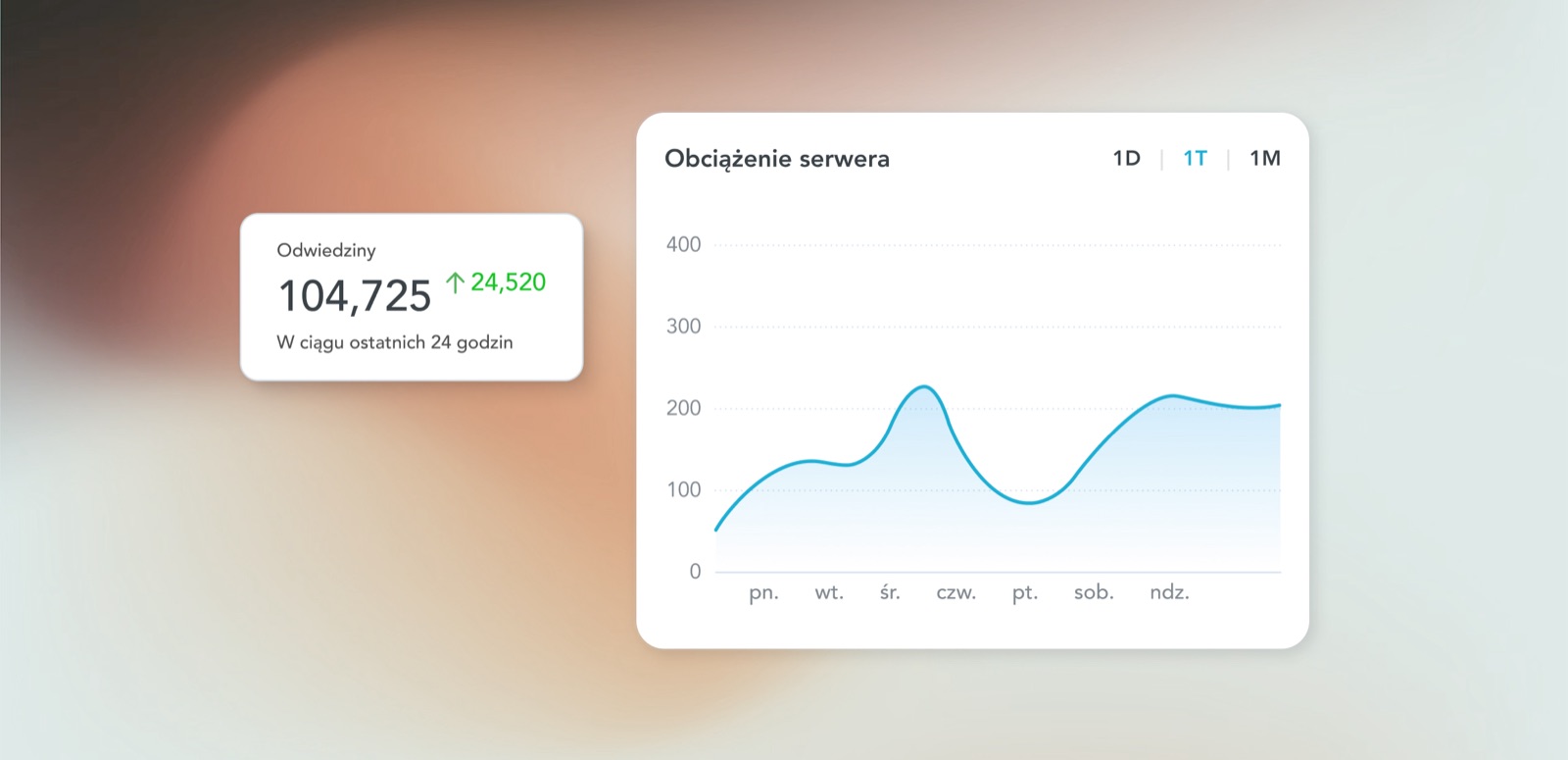
The analytics module turns a dense set of measures into a single, calm view of performance, so customers can see what is happening with their site without needing to decode a technical dashboard.
The clearest changes showed up in how the product started to behave. New accounts stopped opening with a wall of configuration questions. Migrations failed less often because the form asked for the right things at the right moment. Handoff stopped being a negotiation because the patterns were shared. dhosting won a Forbes Diamond 2025 while this work was in progress. That award belongs to the whole company, not to a redesign, but it is the context this work shipped in, and I was the lead product designer on the team at the time.