Clean and functional
Simple, informative layouts with a bit of sophistication.

Modular CMS for a real estate company
Modernbau builds houses and needed a website that carries the brand's Bauhaus-inspired character, geometry, negative space, restraint. The catch was operational. New investments mean new subpages, and the design had to survive being extended without a designer watching over it.
Simple, informative layouts with a bit of sophistication.
Visual language reflecting modernity and the company's Bauhaus references.
Imagery, typography, and negative space doing the storytelling.
Reusable sections and components so a variety of subpages can be created.
The tempting version was a handful of art-directed pages, each composed by hand. It photographs well and dies with the first content update. We built a modular CMS instead, sections with strict rules for imagery, typography, and spacing, composable into any subpage. The cost is giving up one-off layouts. The discipline turned out to be the aesthetic, Bauhaus rewards systems over gestures anyway.
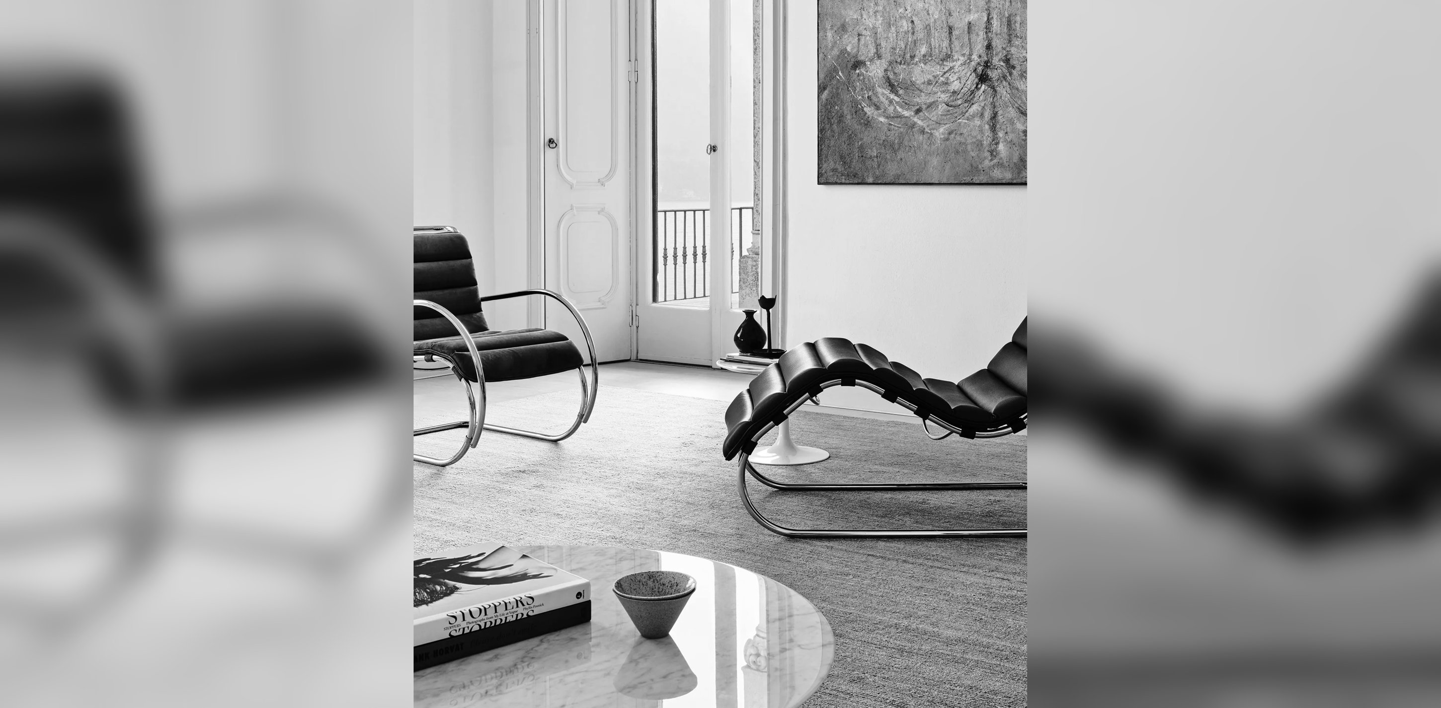
The company's values point straight back to Bauhaus, geometric shapes, modern facilities, honest materials. That gave the design a usable test, if a layout decision wouldn't survive in that tradition, it didn't belong on the site.
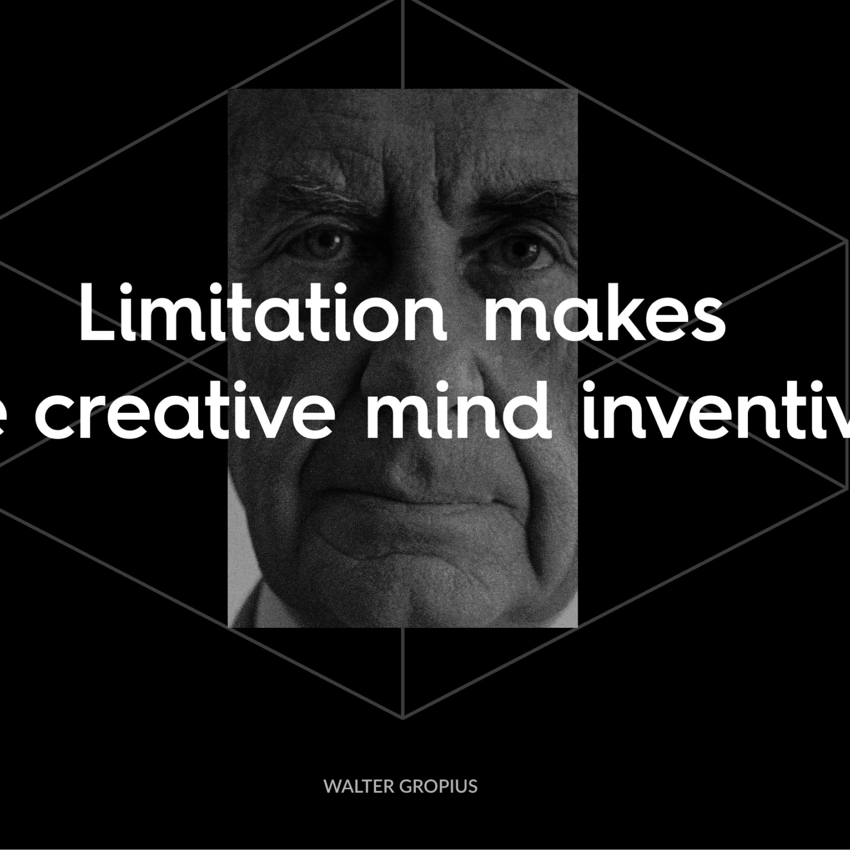
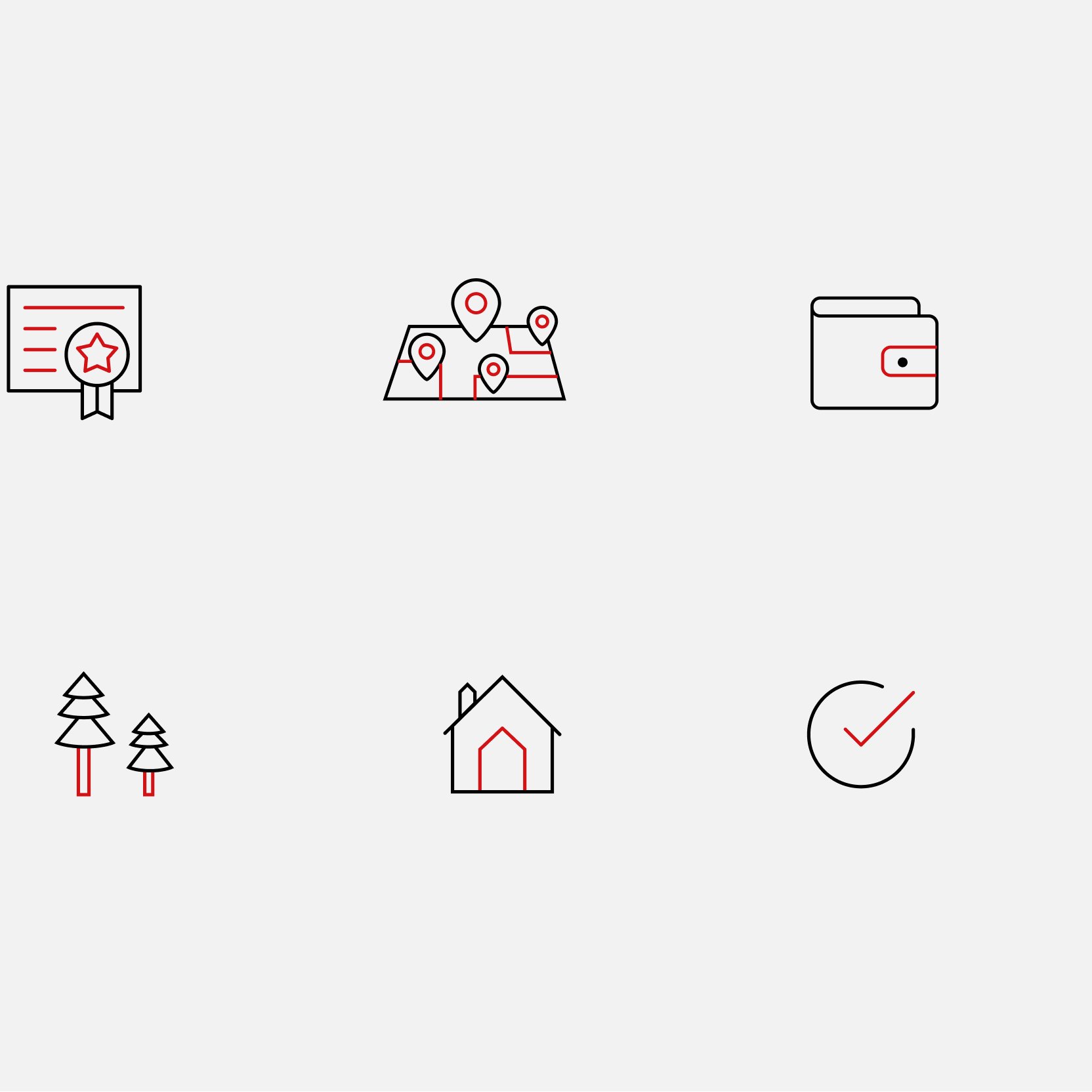
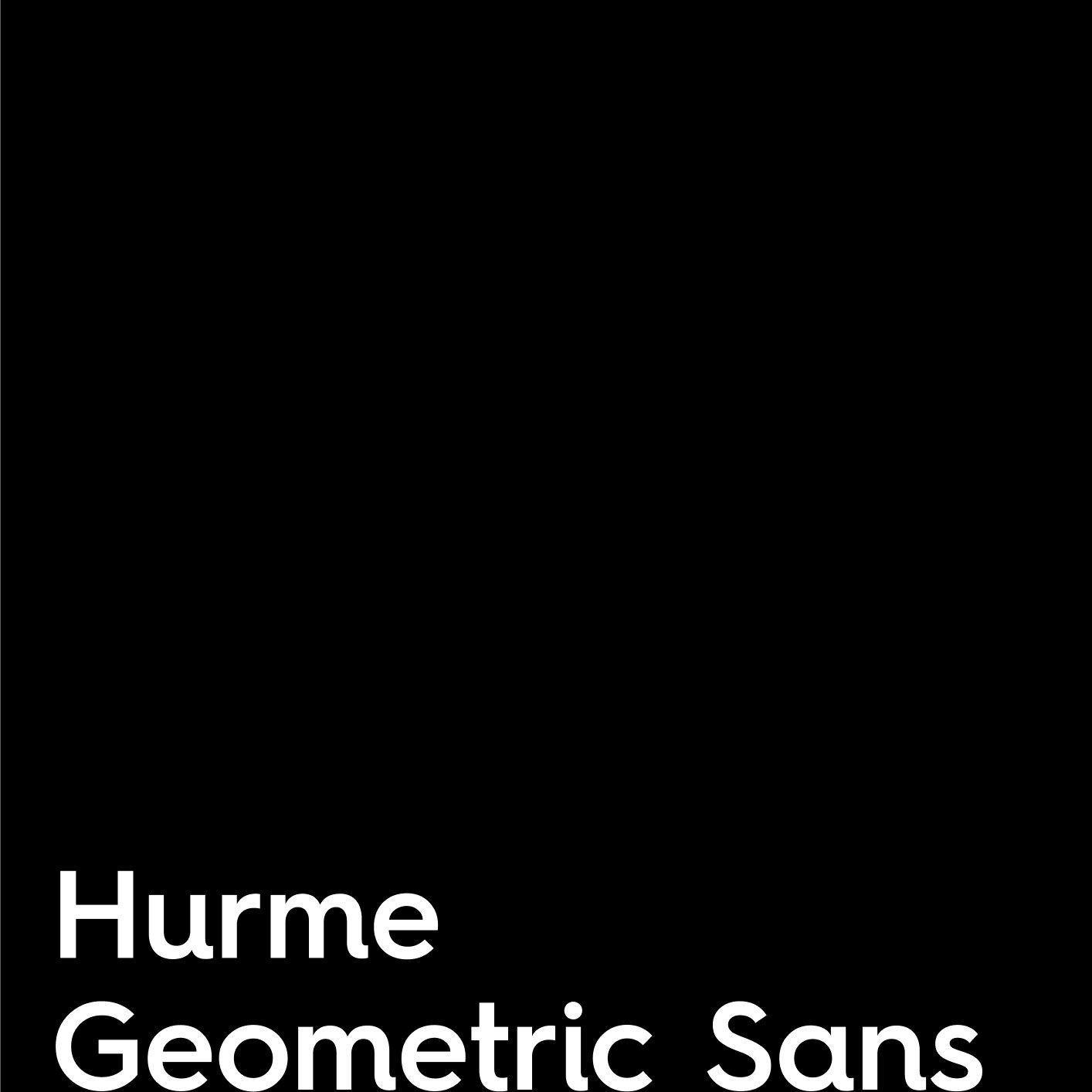
Modernbau came with typography, colors, and a logo. We extended the system where the website needed more, an icon set for investment features, layout grids, and rules for pairing photography with the brand's dark surfaces.
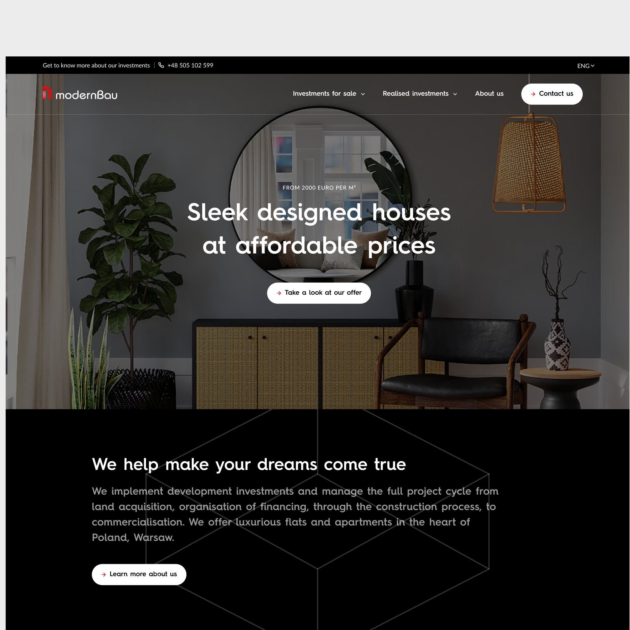
Modernbau's mission was to provide well-designed houses to a broader group of customers.
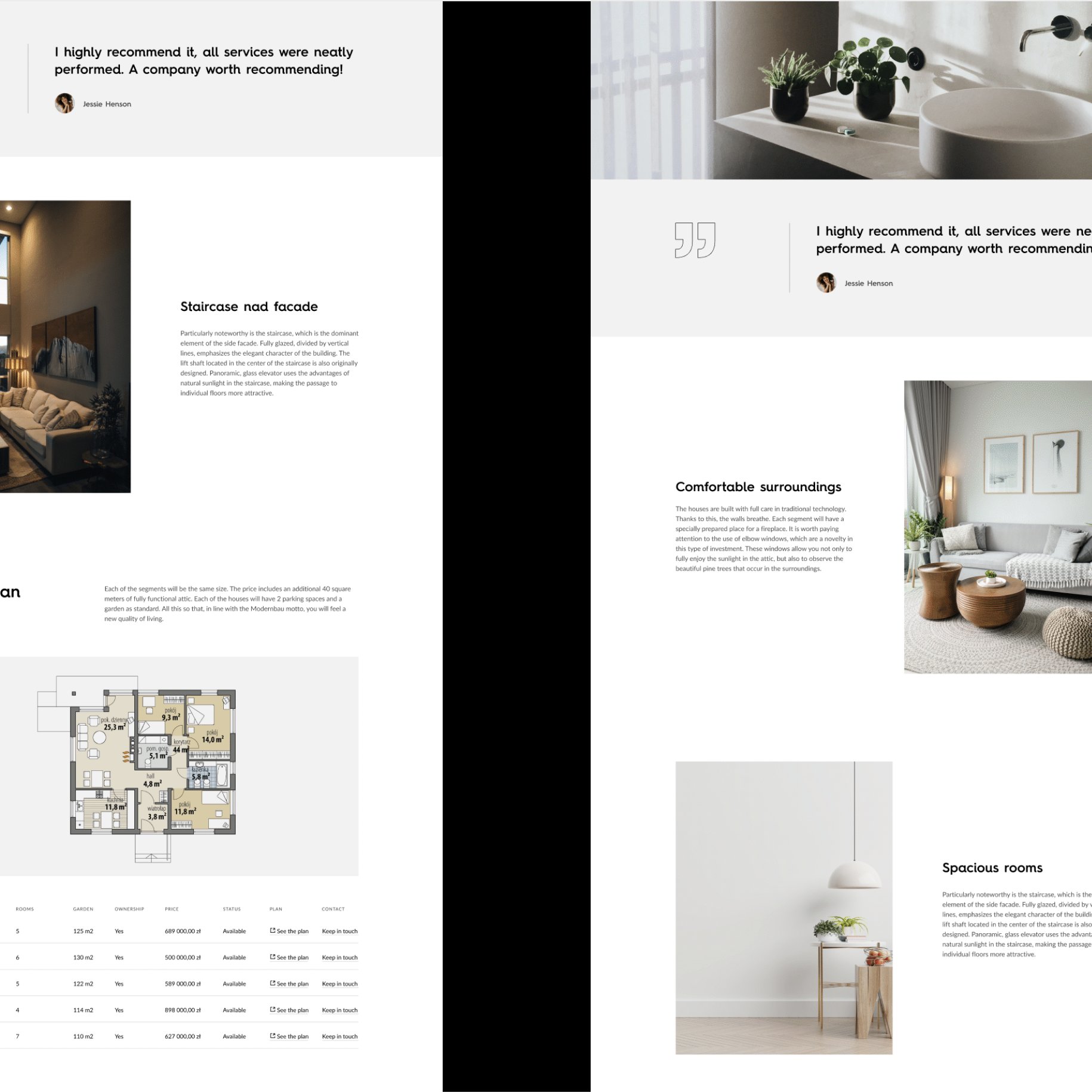
The website translated architectural clarity into reusable page sections and interface patterns.
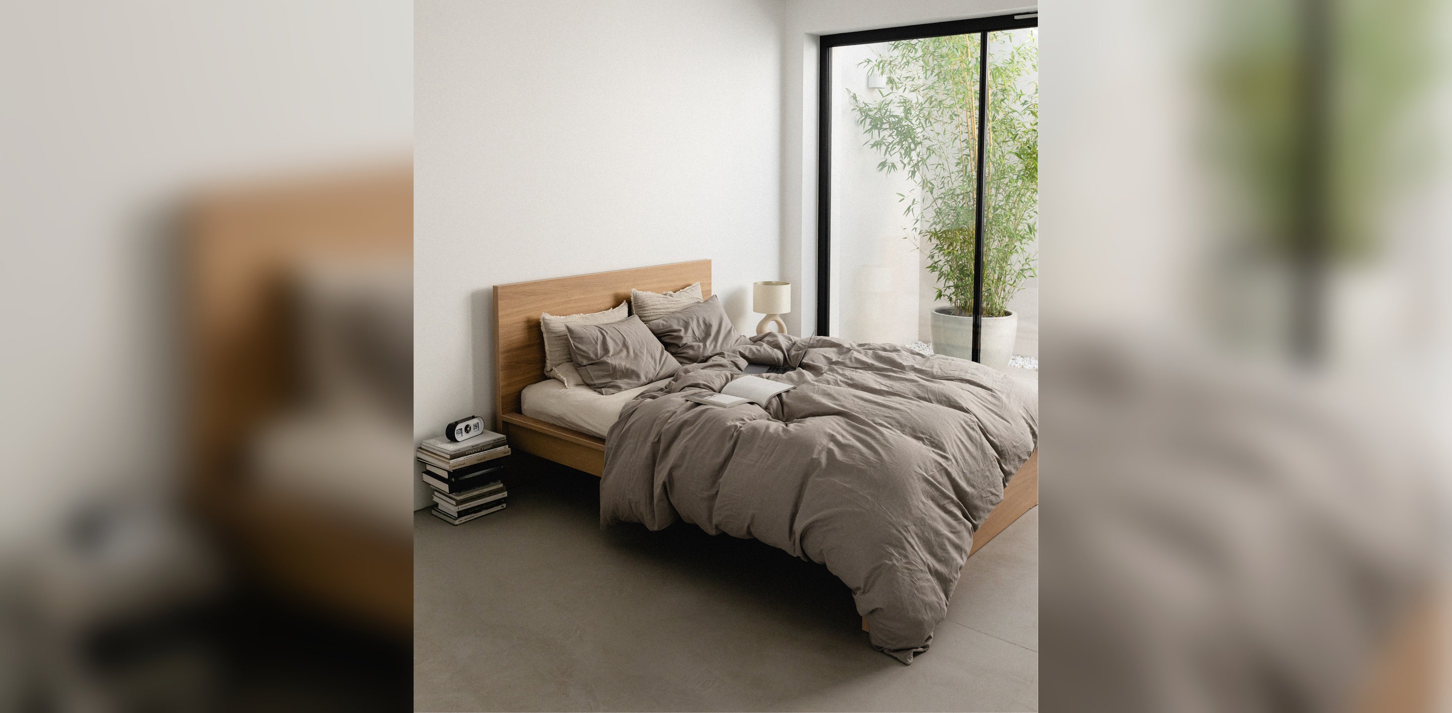
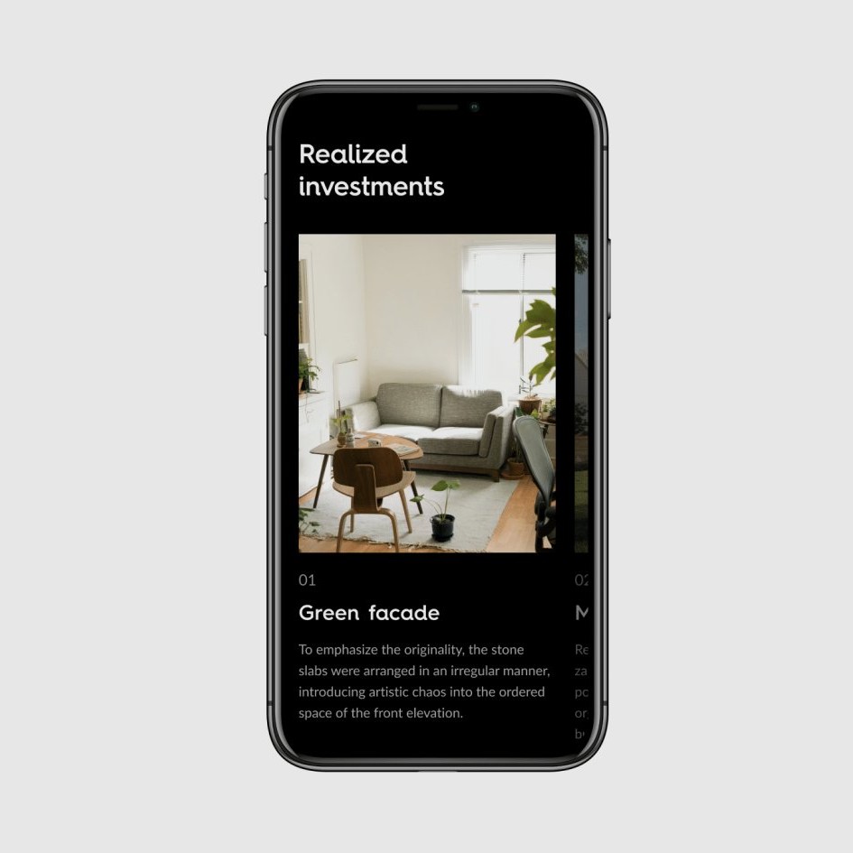
The site shipped as a system, not a set of pages. New investments get their subpages assembled from the modular sections, and they still look like they belong to the brand, without a designer watching over each one. That was the operational catch in the brief, and it's the part that keeps working after the project ended.