Better, not different
Long-time users had the old dashboard in their hands, literally. The refresh had to improve their day without asking them to relearn anything.

A factoring dashboard refreshed without retraining its long-time users.
Faktoria is a factoring dashboard used daily by people who process invoices for a living. The constraint was the brief, refresh it without retraining anyone. Every change had to pass one question, will a daily user notice this for the wrong reason?
The strategy came out of the existing processes and customer feedback, and it fit in one sentence, modernize the surface, leave the workflows alone.
Long-time users had the old dashboard in their hands, literally. The refresh had to improve their day without asking them to relearn anything.
Support ticket volume after launch was the agreed success metric. It kept debates short, if a change risks confusing a daily user, it loses.
The interface had to sit comfortably inside the bank's brand, not next to it.
A large share of users were older. Readability decisions were made for them, not for the screenshots.
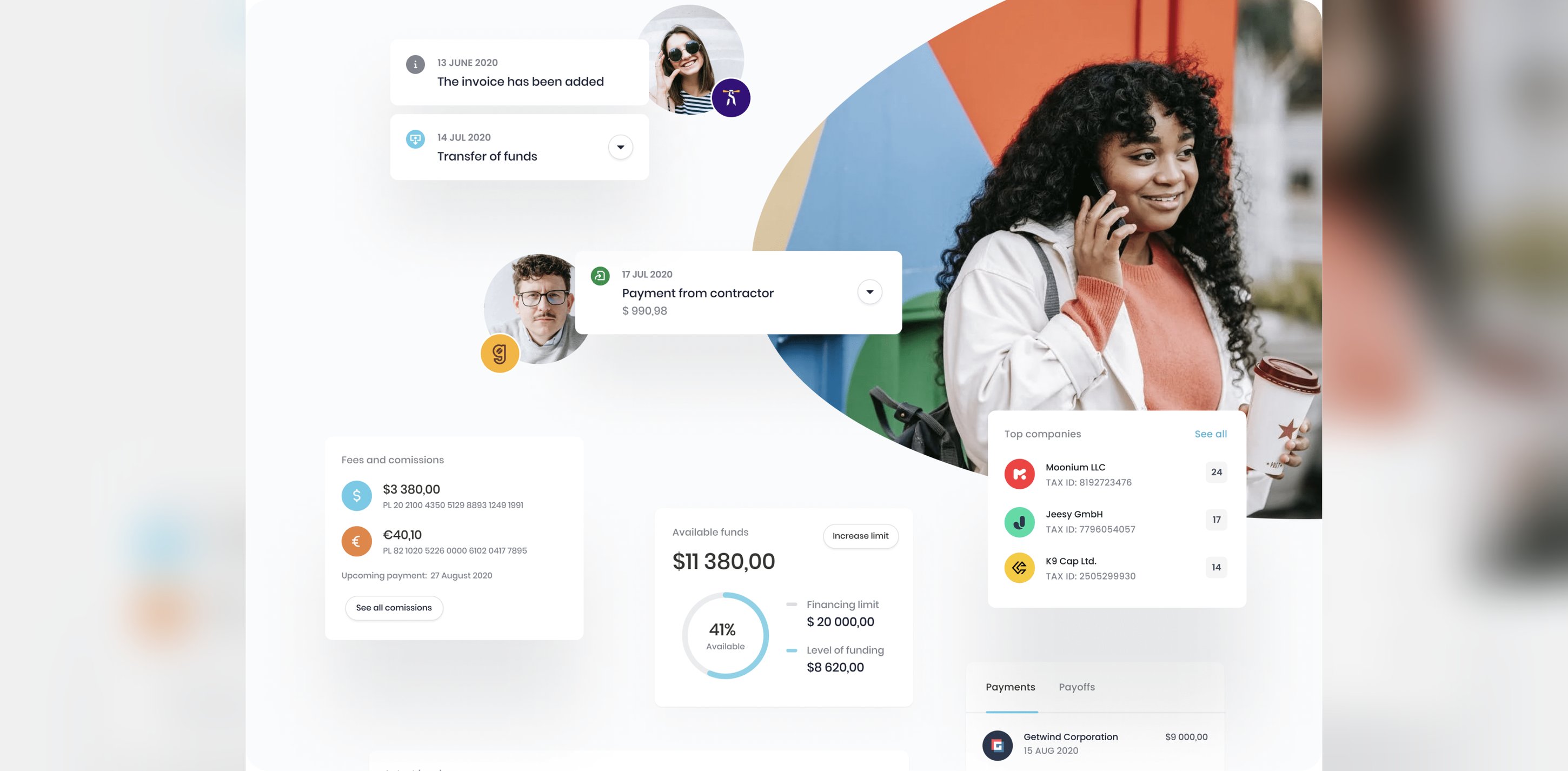
Most of the research was in-depth interviews on both sides of the product, customers who process invoices through Faktoria, and the Nest Bank employees who see what those customers get stuck on. The two groups disagreed often enough to make the interviews worth it.
Customers talked about their needs, then worked through real tasks on prototypes.
Faktoria's staff connected customer pains to the backend processes that caused them.
Session recordings, heatmaps, and surveys showed where behavior contradicted what people said in interviews.
The tempting version was a proper redesign, new layout, cleaner hierarchy, screens that photograph well. We considered it and dropped it. People who process invoices all day navigate by hand, not by reading, and muscle memory is an asset they earned. So the anatomy of every screen stayed put and the work went into what sits on top, hierarchy, readability, states. The cost is a less impressive before-and-after. The payoff is a redesign nobody had to be retrained for.
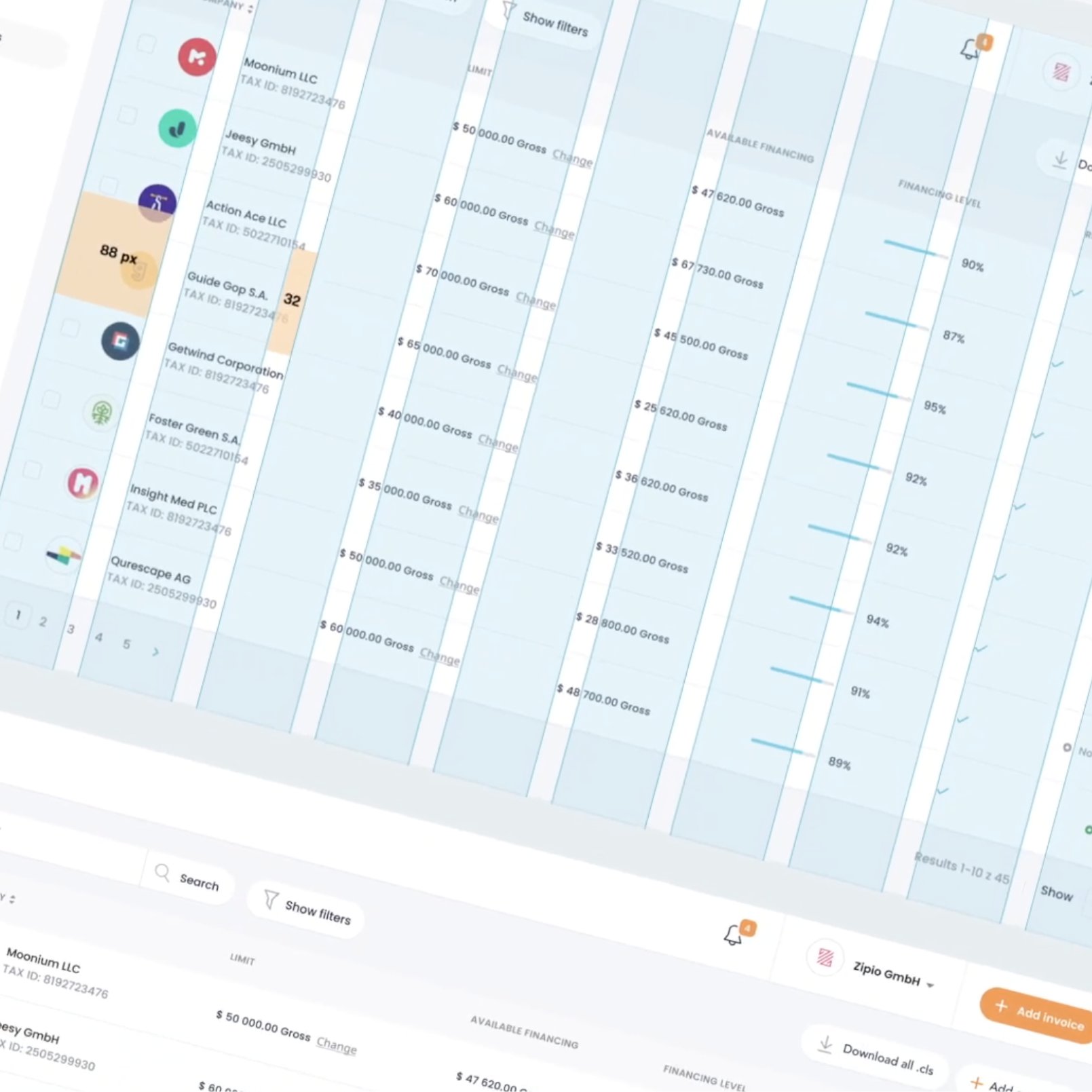
The refresh needed a design system that didn't exist, so we built one from scratch and rebuilt every screen on it. Consistency is what makes "no retraining" hold at scale, once one pattern is learned, the rest come free.
One screen answers the morning question, what needs my attention today? Frequent actions sit on top, detail one click below.
Factoring is watching money move. Status and cashflow read at a glance, because that glance happens dozens of times a day.
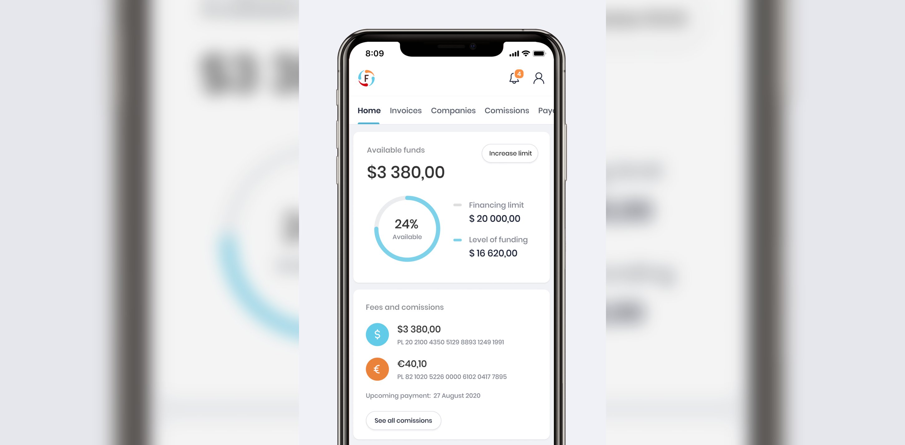
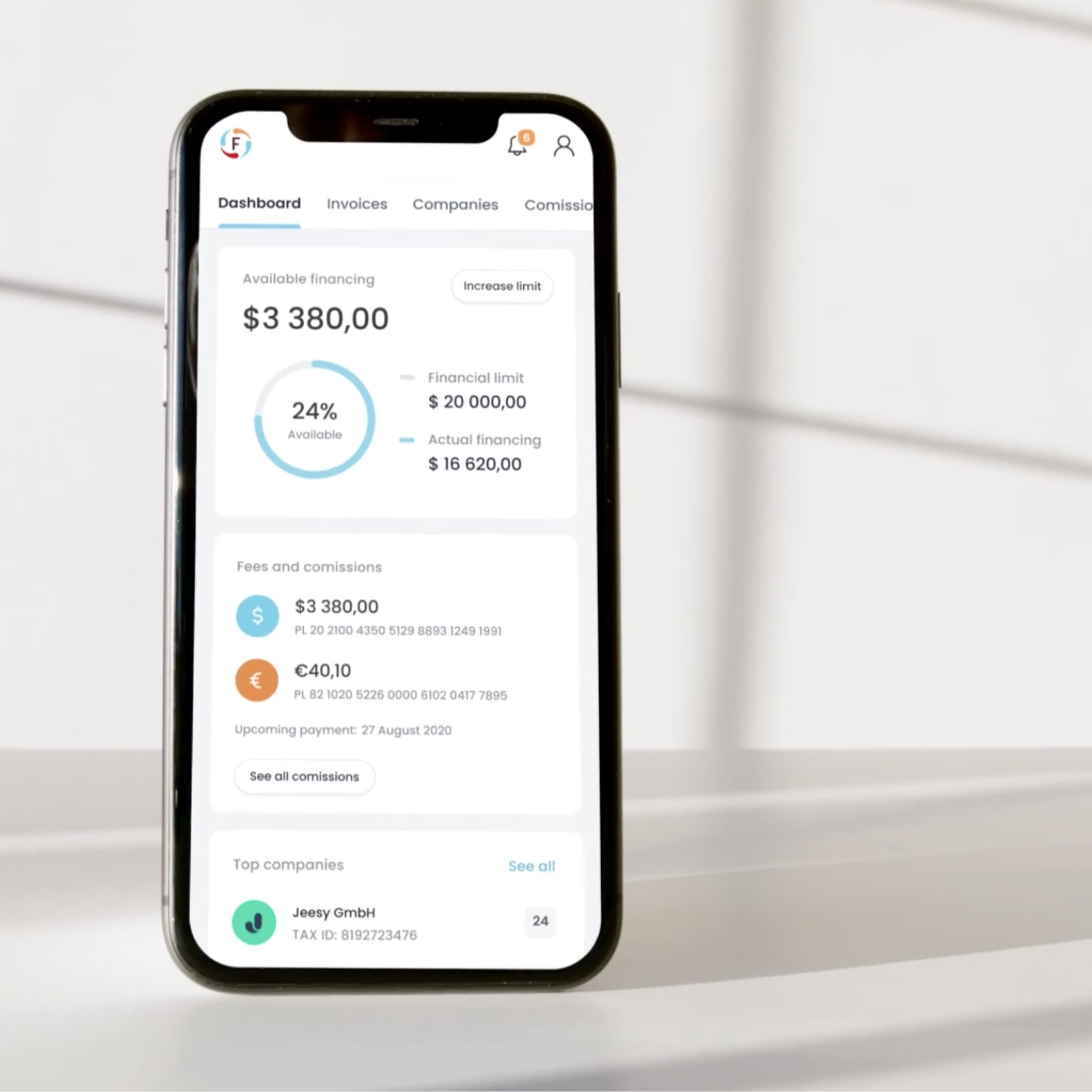
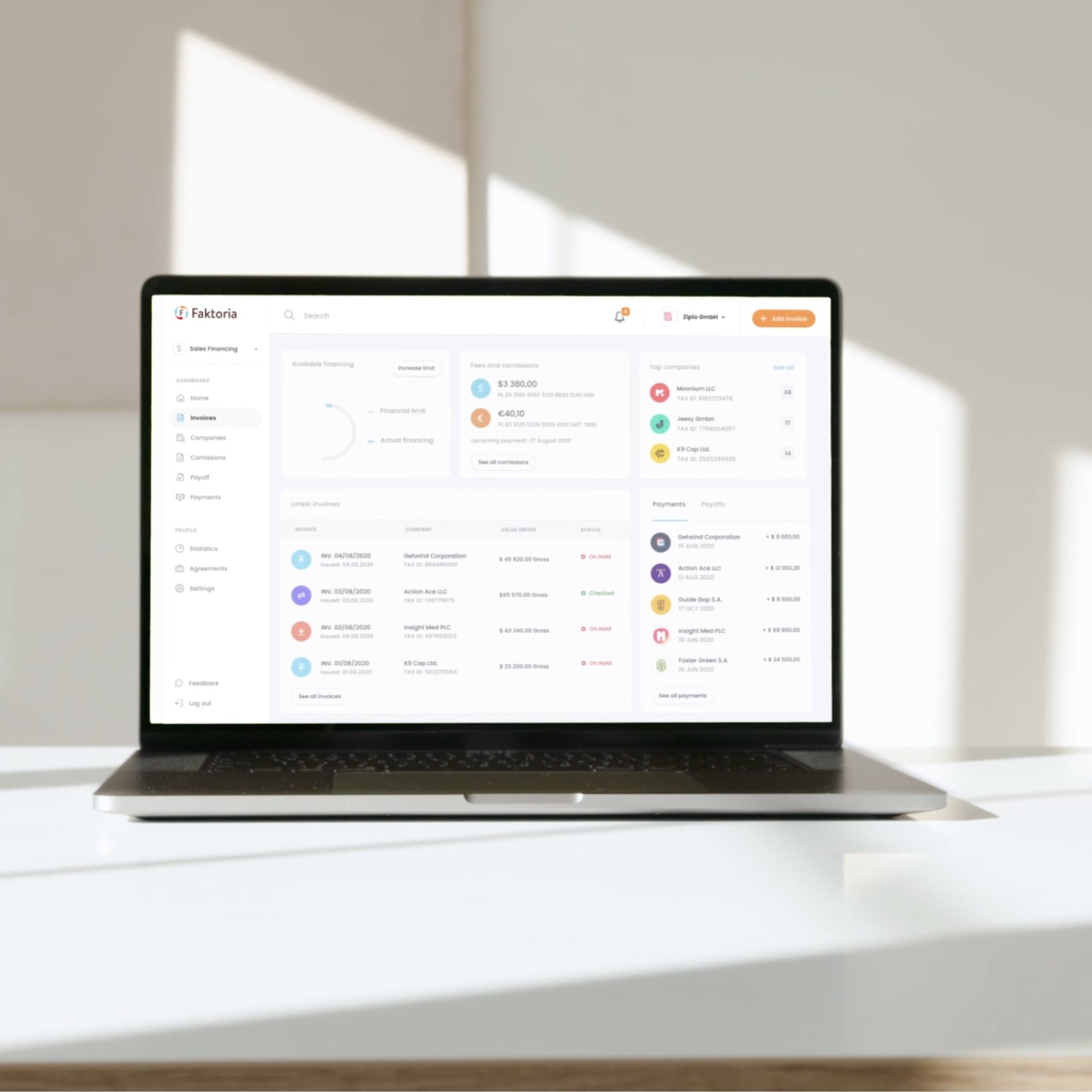
Hierarchy and readability improved underneath workflows that stayed where people's hands expected them. The redesign shipped without a retraining program, which was the whole point.