Simplify product creation
Make the path from photos to finished product understandable on the first try.

Digital product and e-commerce experience for photo products.
Empik Foto turns personal photos into physical products, prints, albums, gifts. That makes it e-commerce with a complication, because the item in the cart is someone's family. The work covered product discovery, the creation flow, and checkout.
Make the path from photos to finished product understandable on the first try.
Reduce friction across discovery, customization, and checkout.
A photo album is a personal object. The interface had to treat it that way, without slowing the purchase down.
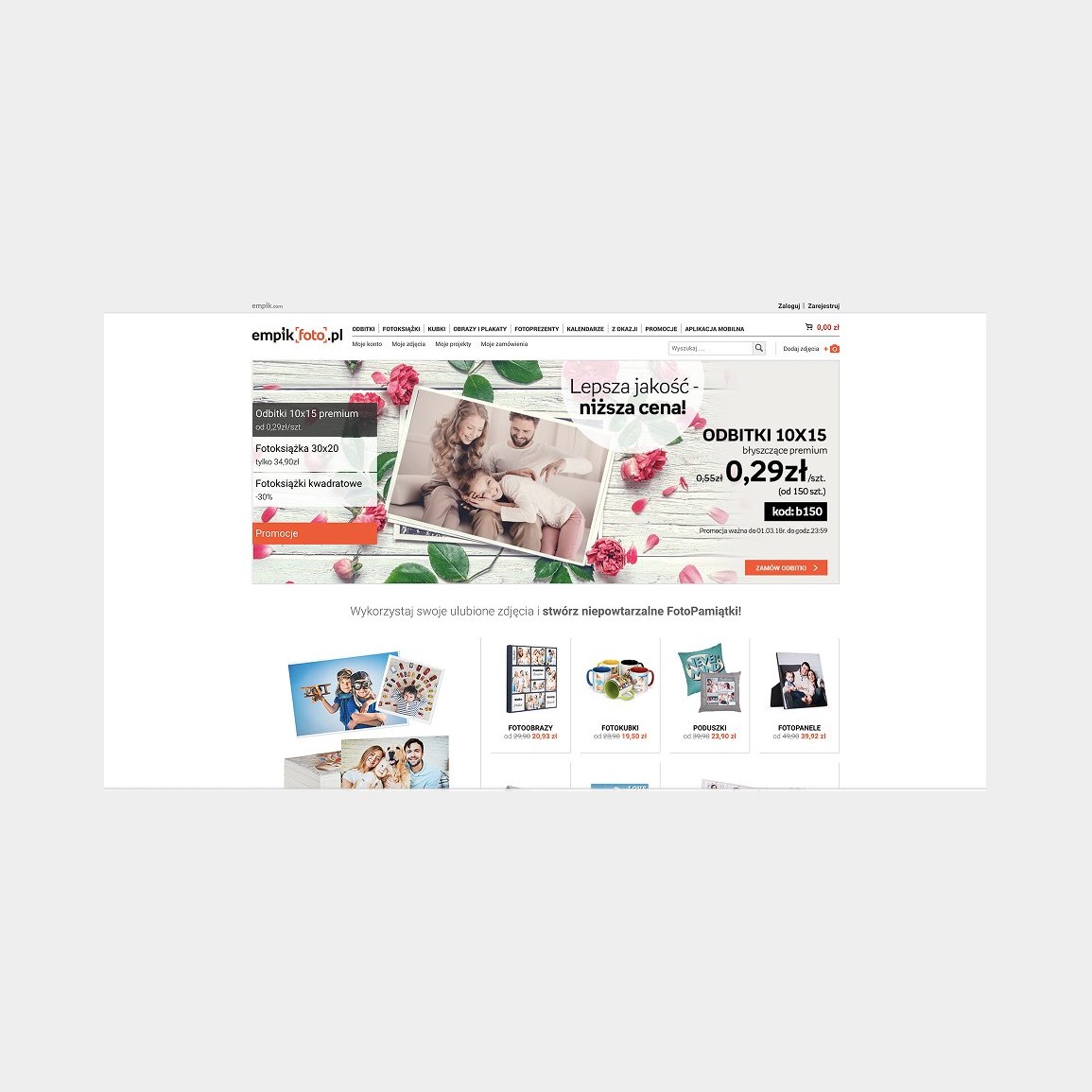
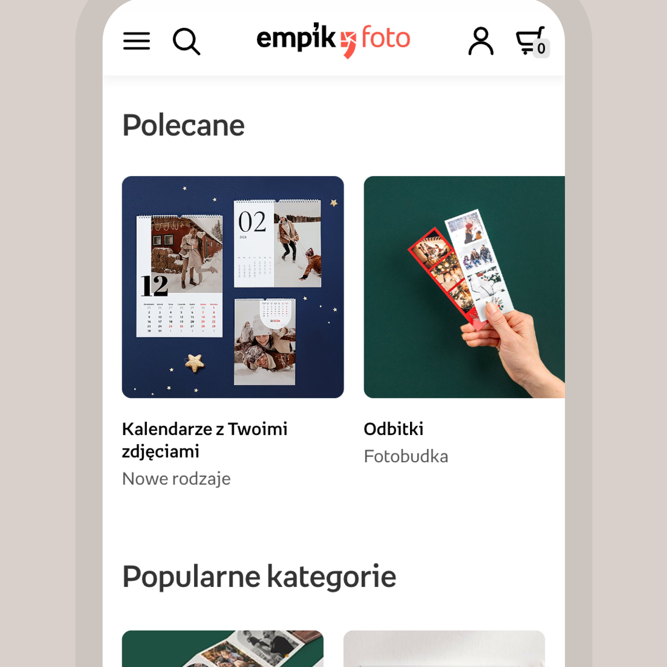
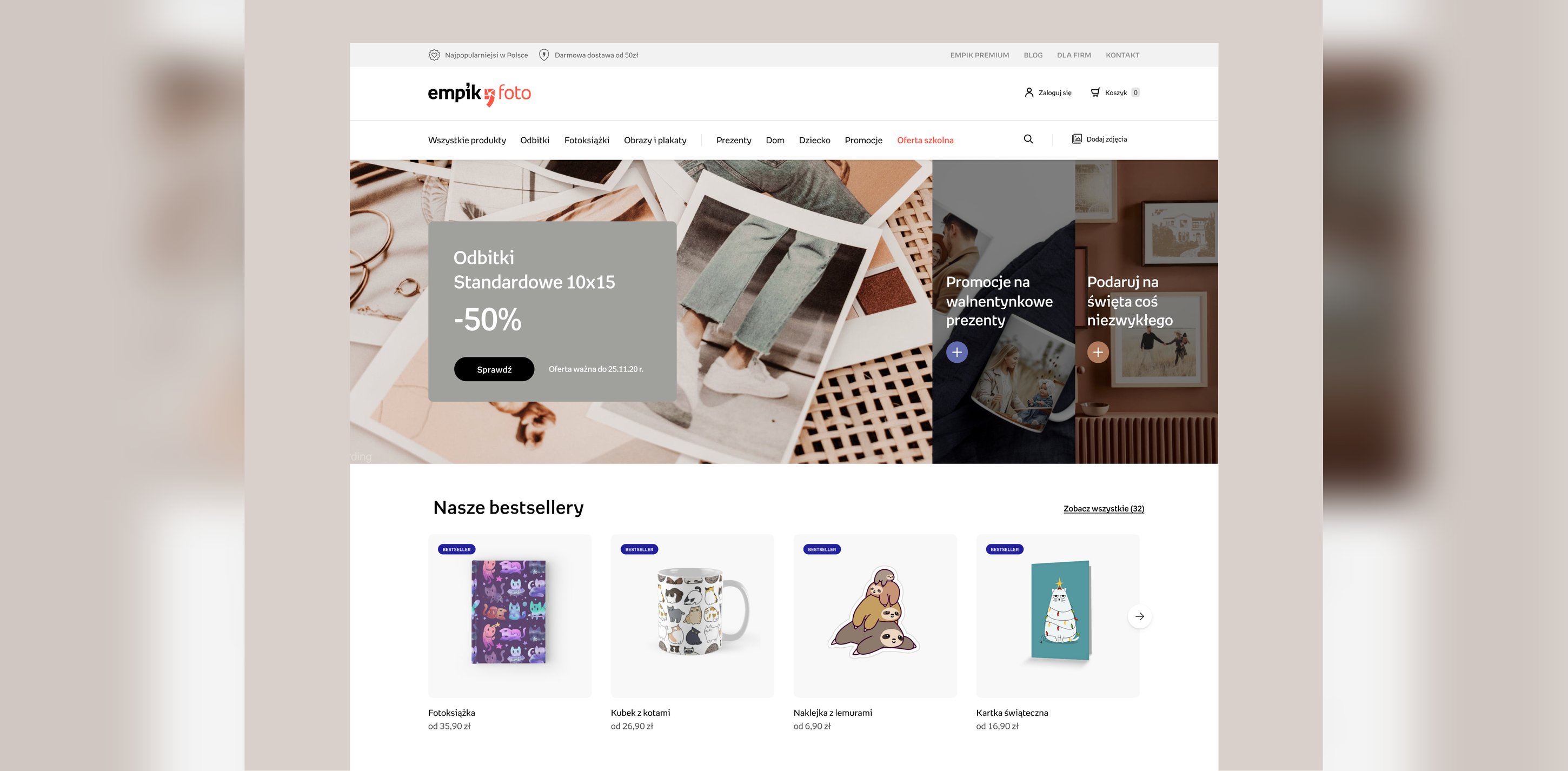
The starting point was a platform that looked and worked like an older generation of e-commerce. The audit named the real problem, a "cheap photo prints" perception the brand needed to move away from. The redesign aimed the identity at premium-but-approachable, so the product feels worth the memories going into it.
A photo-product configurator can be a full editor with every option visible, or a guided path with strong defaults. The editor flatters power users and scares off everyone else. We went with the guided path, pick photos, get a good default layout, adjust only what you care about. The cost is that people who want full control click one level deeper. In exchange, someone making their first photo book reaches the emotional payoff, their own photos in a real product, without passing an exam in layout tools first.
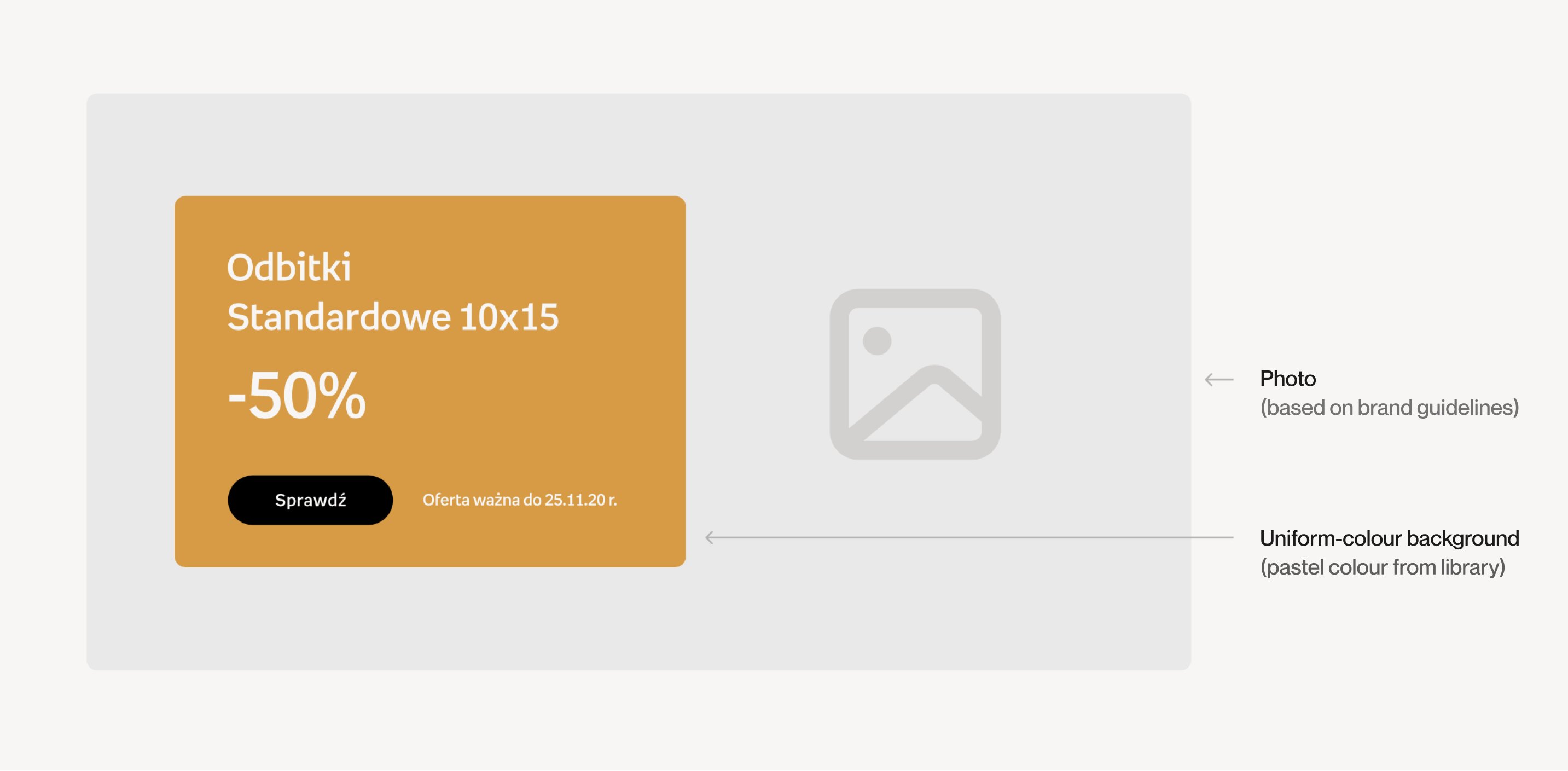
Beyond the screens, the team got a style guide, rules for new layouts, color, and the reworked components. The point was durability, decisions that hold up after the project ends and the next campaign page gets built in-house.
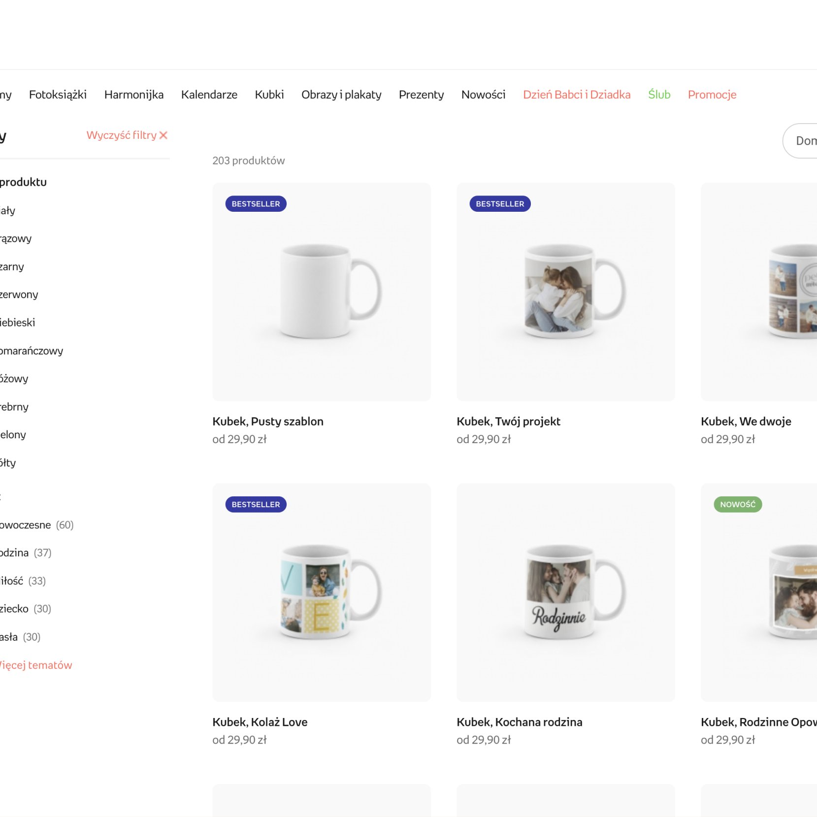
Categories and product information structured so users can choose the right format faster.
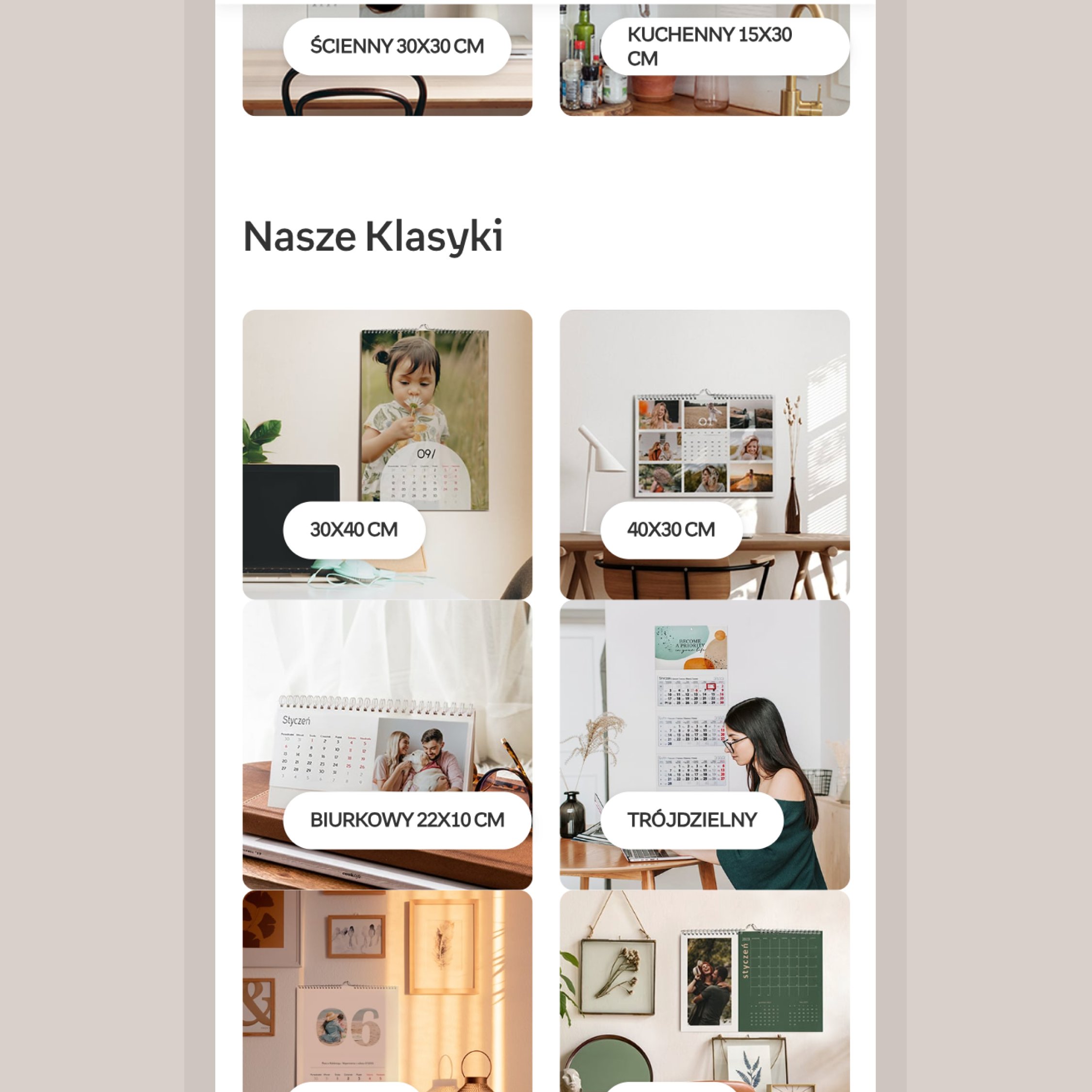
The commerce mechanics stay conventional on purpose. All the novelty budget went into the creation flow.


The guided path shipped as the default, with full control kept one level deeper. The bet is easy to state, more first-time customers finishing an album, at the price of an extra click for the few who want every knob. Checkout stayed boring on purpose, and in e-commerce boring converts.