Improve clarity
Make interfaces easier to understand and navigate.

Designing more inclusive digital experiences.
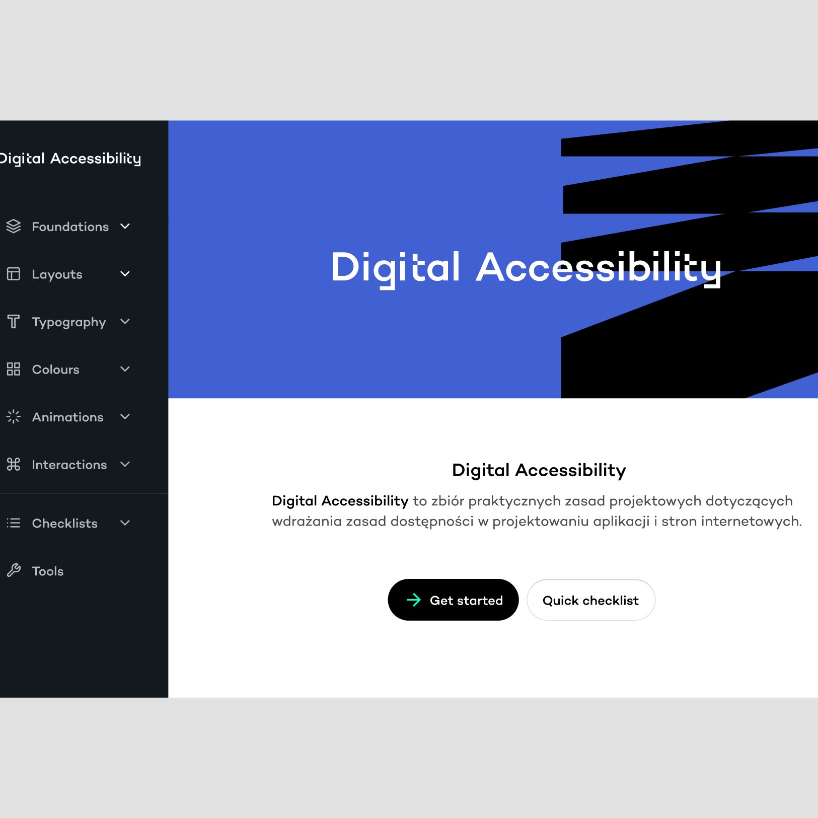
Work gathered around inclusive product thinking, accessibility reviews, UX recommendations, and interface improvements that make digital services usable for more people.
Make interfaces easier to understand and navigate.
Identify patterns that make services harder to use for people with different needs.
Translate accessibility principles into design decisions teams can implement.
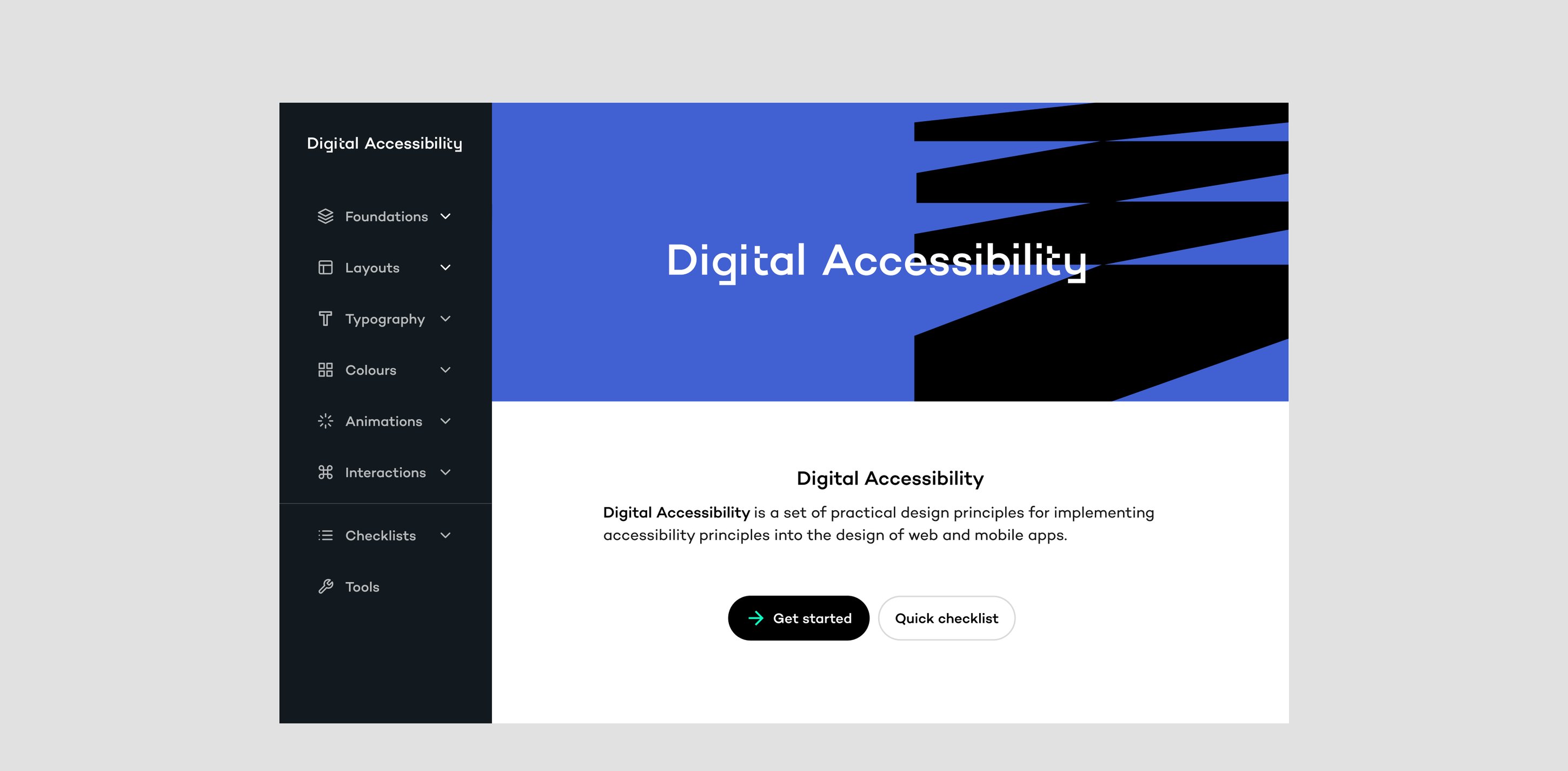
Accessibility pitched as compliance gets scheduled for later. Recommendations here were written as product improvements, clearer hierarchy, visible focus states, predictable interactions, benefits every user can feel. The same change, framed as usability, ships quarters earlier. That framing was a deliberate choice, and it's the difference between an audit that gets implemented and one that gets archived.
The resource sits on a broad reading of disability, not as a fixed trait but as a mismatch between a person and their environment. That framing, drawn from inclusive-design literature, is what lets the guidelines apply to temporary and situational limitations too, not just permanent ones.
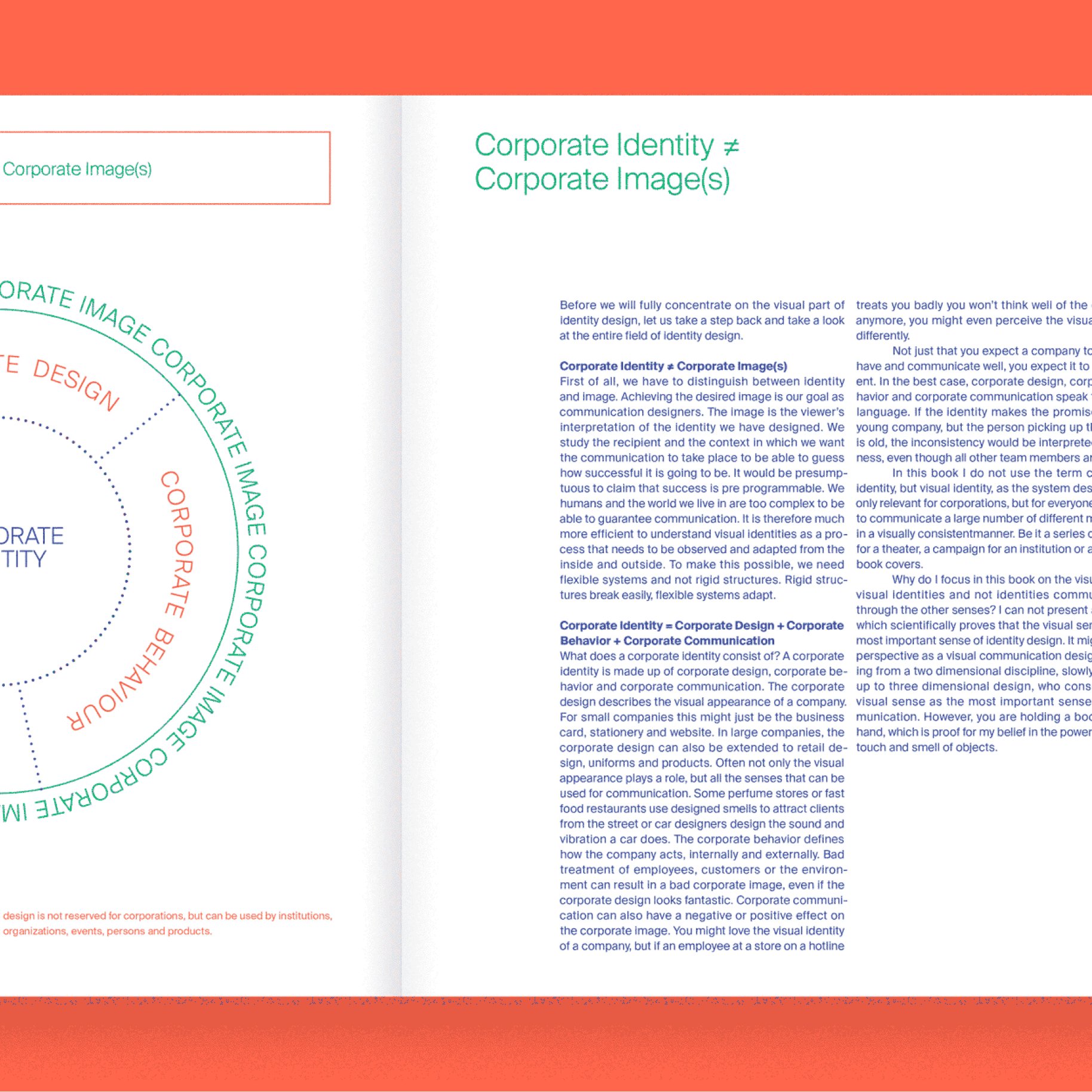

The identity deliberately avoids the usual accessibility clichés. Each category in the design system gets its own visual treatment while staying part of one coherent whole, so the guidelines stay legible and easy to scan across chapters.
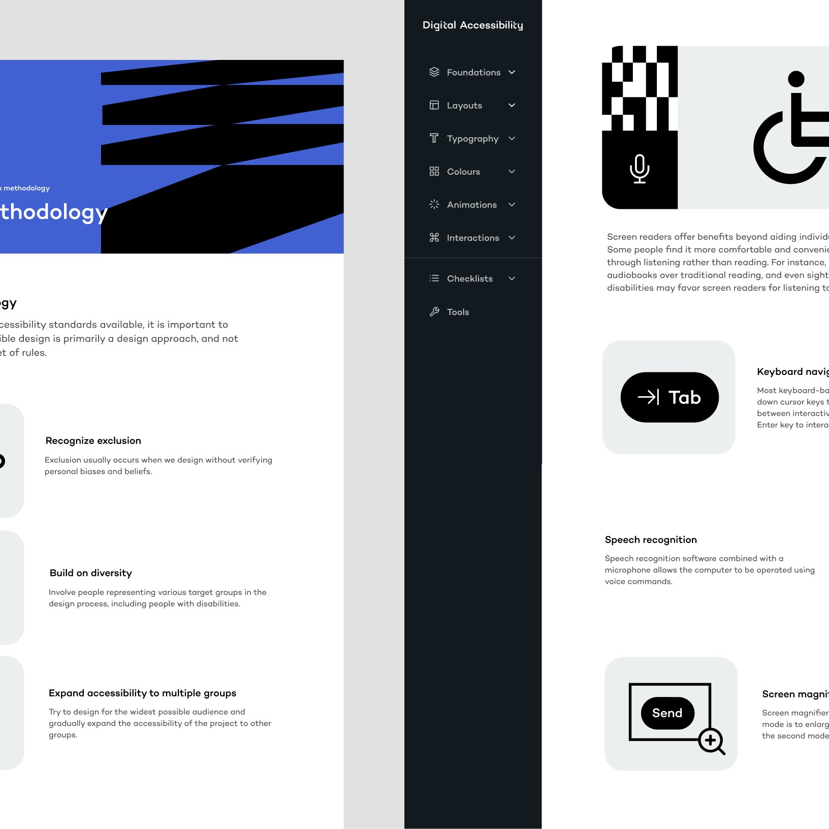
Reusable patterns make accessibility improvements consistent rather than one-off.
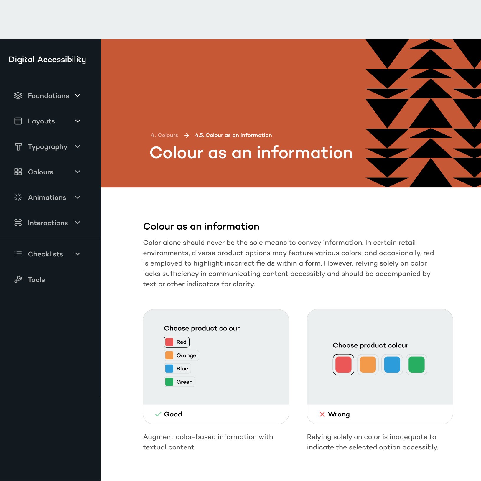
Hierarchy, contrast, focus states, content clarity, interaction predictability.
The result is a set of guidelines teams can actually ship, because every recommendation is written as a product improvement rather than a compliance item. That framing is the real outcome here. An accessibility audit that reads like a usability plan gets built, and the people it was written for feel the difference without ever seeing the document.